A Window to Paris
July 12, 2010 § Leave a comment
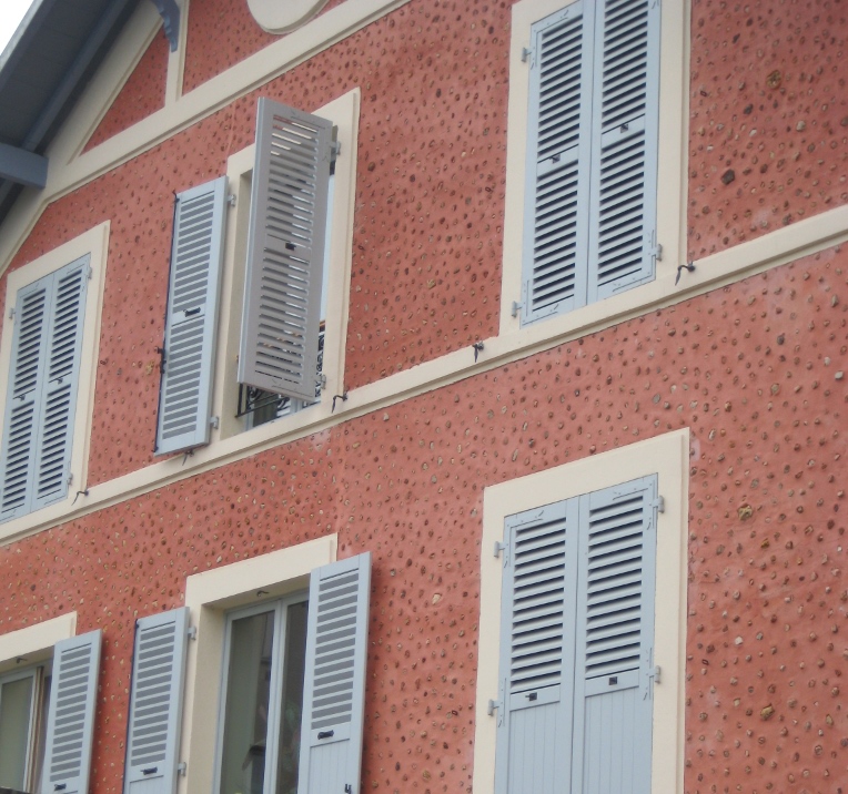
 The windows in Paris are almost as intriguing as the doors! First of all, the shutters actually work, the windows have no screens, and there are no bugs! Plus the shutters are fabulous soft colors of whites and taupes and light blues. The soft colors against the stucco and stone are simply spectacular. Not a black shutter anywhere to be found. I’m thinking that there may be room for more shutter colors in the palette — even on this side of the pond! Why limit ourselves to dark colors!


For stucco and stone homes, consider the subtle sensibilities of French architecture and the superb use of color on shutters. Tres bien!
The Doorways to Paris
July 11, 2010 § 1 Comment
 Whether they’re painted a wonderful milk-paint blue or left a natural wood tone, the doors of Paris are spectacular. It helps, of course, that they’re attached to stunning historic residences that have been there hundreds of years. The scale of the doors is big to fit the scale of the buildings, and the embellishments are breathtaking (spoken like a true decorator). The doors stand out as they are truly meant to — as the focal point of the home or business.

Choosing a Roof Color for a White House
May 7, 2010 § Leave a comment
 Choosing a roof color these days can be overwhelming with all the choices available to us. We’ve gone from classic black and charcoal to every shade of brown, red, green, and even blue. This white house with navy blue shutters looks spectacular with its multi-hued, architectural style blue roof. It really stands out in the neighborhood lined with browns and charcoals. And with a white house, adding a little color to the roof (at least on this house) certainly adds interest without going overboard.
If you have a white colonial and want to replace your roof with a metal style, I suggest sticking to the darker, more traditional colors. A metal roof adds an air of informality (and a touch country) to the house itself so keep that in mind when you’re selecting a roof style. Nothing wrong with metal, but you won’t want to attract too much attention to it if you have a traditional metropolitan house. If you live in the country or the mountains, anything goes!
Choosing a Door Color for a Historic Home
May 6, 2010 § Leave a comment
 Sometimes there’s absolutely nothing more dramatic than a bright, cherry-tomato-red front door. Instead of a more conservative black semi-gloss, the homeowners of this gray limestone with white window and door trim, wrought iron railings and lampposts, and concrete steps have punctuated their predictable historic facade with a splash of red right off the vine!
No need to wave a flag for guests to know where to ring the doorbell. The entry boldly exclaims, “Welcome Home!”
Nice choice!
Details Make the Difference at the Front Door
April 26, 2010 § Leave a comment
 Say nothing of the new Arts & Crafts windows, textured roof, earthy natural taupe siding color, crisp white trim, and fresh landscaping, the entryway of this renovated colonial is a knock-out.
The homeowners took their time to get all the details right. The enlarged portico with dry-stacked stone porch and columns, the tapered pillars above, the arched wood ceiling, wide chunk white contrasting trim, a period pendant light fixture, and the solid wood door with period wrought-iron hardware. There’s even a little black door-bell (with undoubtedly a charming ring on the inside).
What can I say… there goes the neighborhood…
Blond Brick Siding Color and Trim
April 25, 2010 § Leave a comment
 Blond brick and light-colored stone seem to pose challenges when it comes to picking coordinating paint colors for siding and trim. This house does it right. The taupe siding color comes right out of the aging blond brick, giving the house an updated look. Taupe allows the brick to show off its depth of color, including other shades of browns and peaches, without adding another hue to the mix. You cannot go wrong with neutrals, especially when you’re dealing with stone and brick.
White trim offers a crisp contrast between the siding and brick and ties in the white windows, also original to the house. The homeowners took what used to be a tired ordinary blond brick and made it look fresh and contemporary.
House Color, Trim, Shutters: Gold Medal Combo
April 7, 2010 § 2 Comments
 The unexpected color combination on this historic home (now a B&B in Sackets Harbor, NY) really pops off the street. Whether it’s the hint of green in the gold siding, the Jamaican rum-like warmth of the shutters, or simply the combination, I’m not sure. But coupled with cream trim and accents of black, this combination is a winner.
The house color looks like Ben Moore’s Marblehead Gold (HC-11), and the shutters look like a slightly darker version of Copper Kettle (1218). I should have rung the doorbell to ask (I’ve been known to do that).
The stone steps unfold seamlessly from the foundation right onto the sidewalk and the delicate scrollwork in the iron railing ties in beautifully with the sign and even the shutter “dogs.” And for those of you who have asked about using cream window trim with white windows, here’s a great example of how nicely it works.
