Curb Appeal Refresh: The Front Door
May 22, 2019 § Leave a comment
Some of you may remember when the fashion industry changed the skirt hem length every year — from maxi to mini to midi and then back to comfortably above the knee.
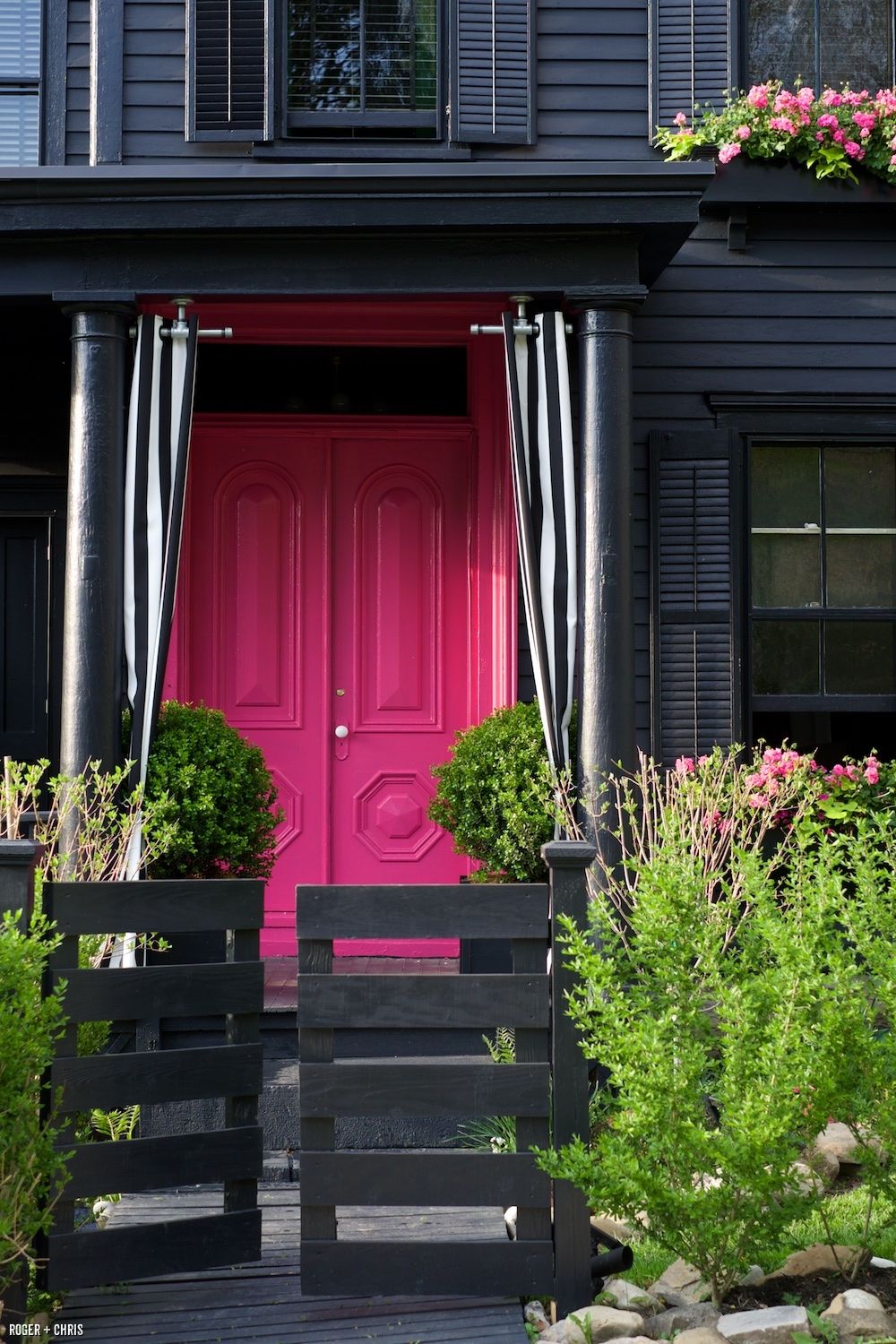
Front door color has followed a fashion trend of its own. A decade ago, red was all the rage — and for some it continues to be the most welcoming front door color. Black with a metal kick plate has always offered a sophisticated read on the front entry. But what has followed in more recent years has been a busting-out of traditional exterior curb appeal. Here’s what front door colors we were talking about just 3 years ago.
So it is time to update those door trends again. No more copycat door-painting just to be fashionable. We’re stepping out of the shade of the porch to a bold new entryway that will set each house apart from its neighbors.
But first, let’s talk about house colors. What has changed:
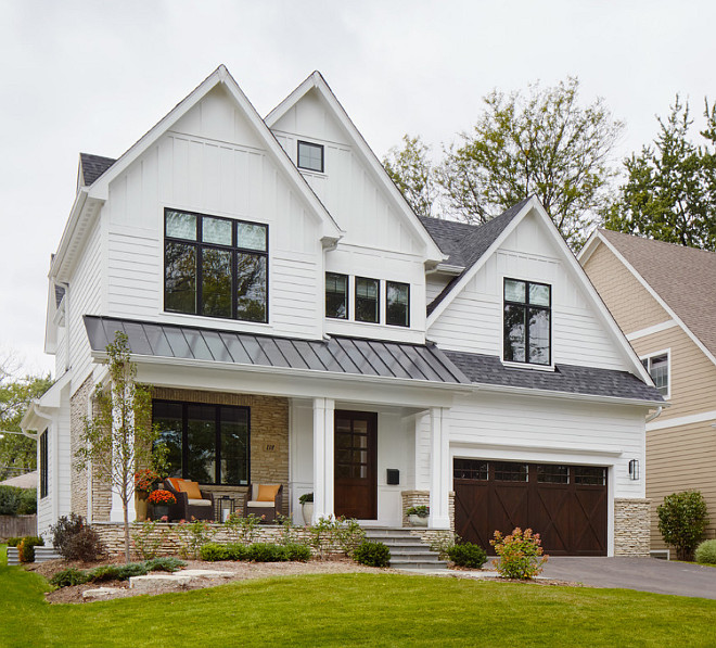
–More white houses. It used to be that white fell to farmhouses and antique colonials. Not anymore. There is plenty of white new construction, which opens up a fan deck of front door options.
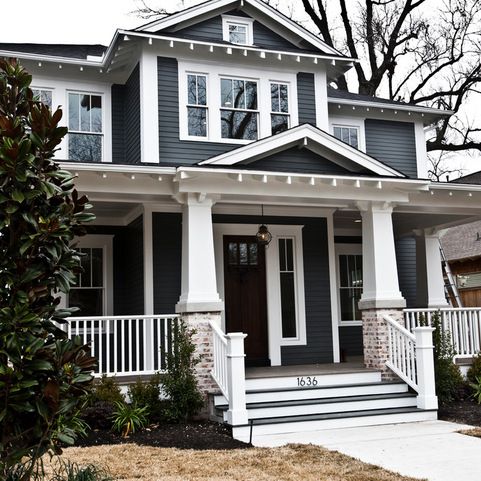
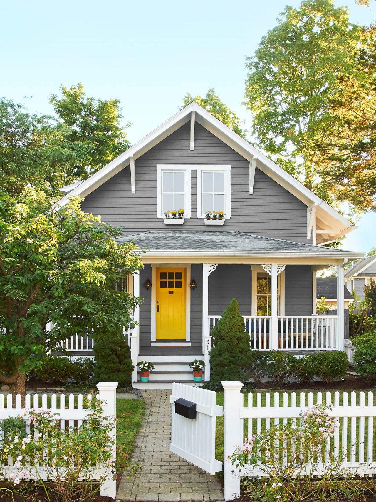
–More gray houses. Always a neutral that fits into almost any environment, the gray interior trend moved to the outside and remains. Gray also opens up a fan deck of front door options, maybe just a few fewer than white.
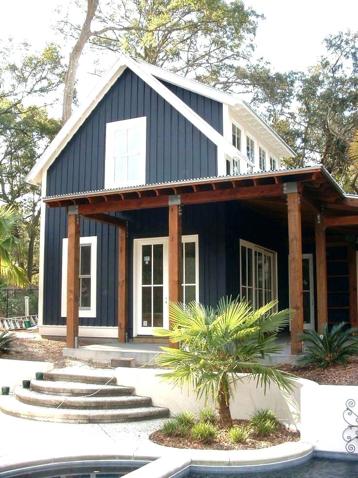
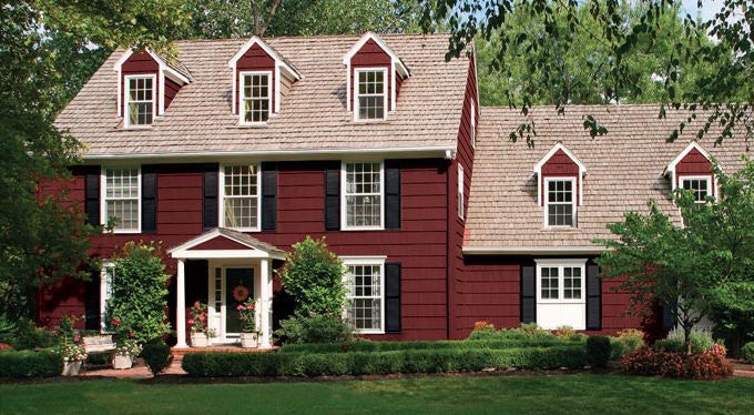
–More Crayola color and less safe beige. Dark and rich are replacing light and airy. Briarwood is moving to Hale Navy. Rich Cream is moving to Merlot Red. Even some developments are providing a rainbow of siding options instead of the light neutrals from years past. <<applause>> If you have a bold red house, you probably don’t need me to tell you what color to paint your front door (lol!), but I’ll offer suggestions anyway.
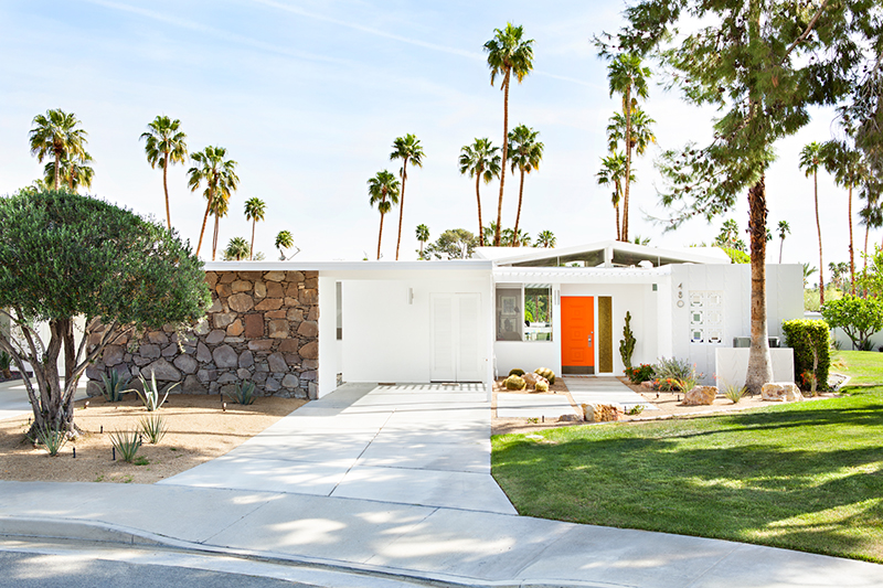
–More midcentury renos, both contemporary and ranch style. With a surge in client interest for open-concept living (uh-oh to that trend, but that’s another story), people have realized that it is easier to update an already open midcentury home with the high vaulted ceilings and the great-room flow than it is to modify a boxy colonial. Big surprise there. So we are seeing a plethora of exterior colors (even black) as a result of these one-story re-dos.
Back to the front door. Here are some ideas for redoing your front door color to refresh your home.
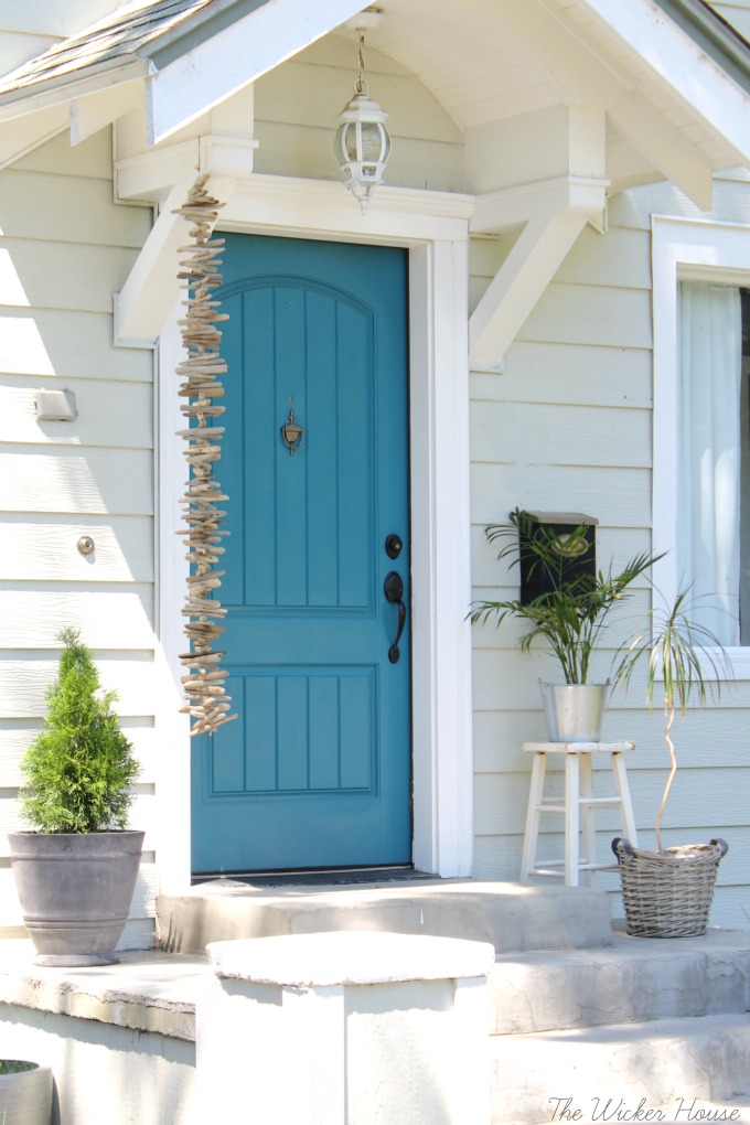
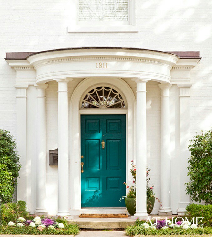
Teal and Turquoise — I cannot believe that I used to recommend turquoise only for tropical house locations or homes that at least had a pool. What used to be a quest to coordinate house colors with the local environment is now a challenge to ignore it. Where teal and turquoise work: on gray, white, black, yellow, red, okay almost every house color except blue. Where they do not work: on dirty or faded house siding (the bright color makes the house look worse) and on other blues like colonial blue.
Yellow and Orange — not everybody’s favorite colors but they are so happy. I love them on a front door. Where they work: on dark house colors like navy, green-browns, dark and light grays, neutral gray brick, and white. Where they do not work: Again, on any color that looks faded, aged, or dirty.
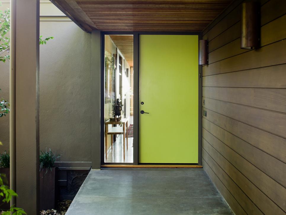
Lime Green — fresh and springy and a wonderful coordinating color for your landscape. Where it works: dark gray, navy blue, even red brick, chocolate brown, black. Where it does not work: any other green or dirty beige.
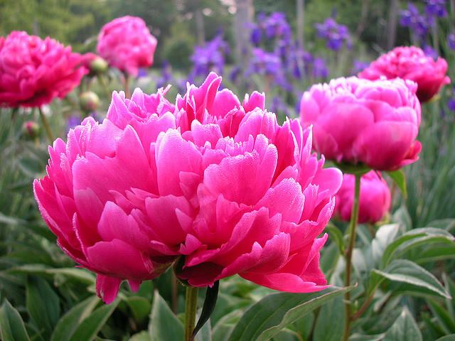
Pink and Purple – always beautiful on a white house with coordinating landscape trees but also on a dark house for a real pop of warmth in the neighborhood. Where they work: white, gray, navy. Where they do not work: on yellow beiges and orange beiges because of the undertones and on anything that has a faded or dirty appearance.

If the bright colors will not work with your house color, try natural or even white.
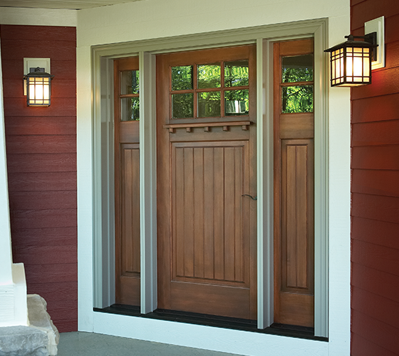
Natural Wood or wood-look – always a classic. Where it works: navy and red, for sure. And just about every other house color.
White — yes white! What white does is make the whole entry area look larger since it blends with the white trim color. It also creates a blank canvas for holiday decor — wreathes, flower pots, etc. There is nothing quite like white as a backdrop to a variety of color palettes around the entryway. Where it works: especially good on a house with a lot of color already and crisp white trim. Also works on neutrals when you want to maintain a soft neutral palette throughout — be sure to add textures though with lots of greenery and baskets or wicker furniture. White also works on aged or faded houses where the bright colors do not. Crisp white perks everything up.

I hope these ideas dazzle your thinking and inspire you to head to the paint store. Happy painting, everybody!
What Color Brings You Joy?
January 23, 2019 § Leave a comment
As I type the title into this blog post, I am struck by how nearly impossible that question is to answer for somebody like me who loves almost all hues. How would I ever pick a favorite? But some people have no problem.
In the latest House Beautiful (Jan/Feb 2019 issue) amidst the usual articles about paint color trends and new wallpaper patterns, a spread jumped out of the magazine when I turned the page. Designer Kristen McCory and editor Emma Bazilian lay out a color palette that I would not expect to see in a Connecticut home.
There in a high-gloss fuchsia fiesta was a fireplace surround and mantel popping out of the living room wall. And there was more! A hot pink antique secretary and a raspberry velvet settee left no doubt as to the intentions of the designer. The homeowner wanted Pink. (That’s Benjamin Moore’s Gypsy Pink on the mantel.)
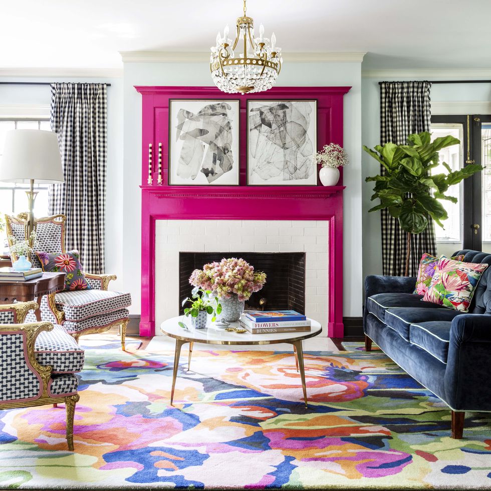
But the story gets so sweet when we discover that the pink is a tribute to the homeowner’s 99-year-old grandmother whose favorite lipstick was Revlon’s Parisian Pink. And that is what brings me to ask “What color brings YOU joy?”
For me? I guess I’m kind of in a Pink frame of mind these days — it’s bitter cold outside and that warm pink hue brings joy to my heart when I stare at it long enough. Witness my Facebook page yesterday —>
But by Spring I know I will have put all the warm colors into the closets and brought out blues to cool the house down and bring me newfound joy. I’m not sure what it is about turquoise, teal, and aqua that I love so much but maybe it’s what those colors represent to me: in this case, last year’s vacation with my precious sister! When I see ocean blues now, I think of her and it brings me joy.

Whatever color brings you joy (always or maybe just right now) … embrace it. Wear it, decorate with it, and share it with others. Don’t worry about keeping up with trends that make others happy. When clients tell me they want a color for their kitchen that is the same color as their best friend’s kitchen, I always push back a little. It never fails. What looks good in somebody else’s house is inevitably a big fail somewhere else. Don’t pick a yellow front door because your neighbor has one. As we say so often these days… You Do You.
What Color Brings YOU Joy?
Pink Doors and Why They Work
February 5, 2018 § Leave a comment
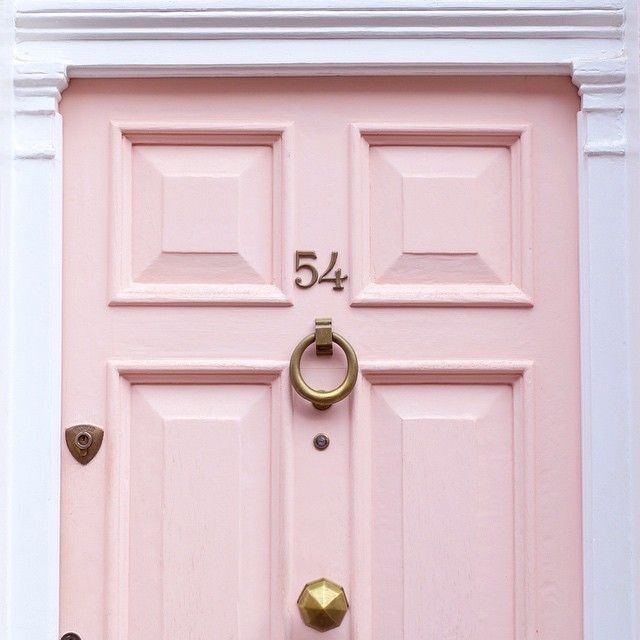
Pink — a trend we’ve been watching for the past couple of years — is no longer labeled, as my mother used to say, SS&G (sweet, simple, and “girlish”). On the contrary. The color keeps popping up with some staying power, and where it has grabbed my attention the most is at the front door.
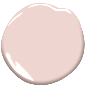
This Pleasant Pink by Benjamin Moore is a comfortably sophisticated hue that blends rose with peach and a touch of gray undertone that keeps it from looking too bubble-gummy or baby’s room. Antique brass metal hardware (as on the London door above) will give the color an aged quality that keeps it from looking too trendy.
Why does pink work so well as a door color? Because it compliments many exterior house colors and coordinates with pinks and whites and purples in the landscape plantings. Here are a few ideas:
Behr’s Road Less Traveled from the 2018 palette is a soft mushroomy gray brown that coordinates nicely with stone walls and wooded environs and looks fabulous with white trim and a pink door. And although cherry blossoms do not last very long, for a few weeks out of the year your house will have traffic slowing down to take photos.


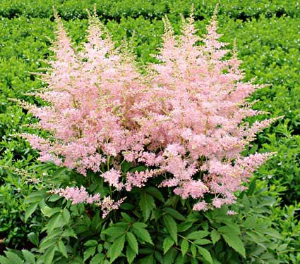
Another house color that looks great with a pink door is gray– it’s a classic combination. This gray, Benjamin Moore’s Stormy Monday, paired with pink creates a quiet traditional combo whose matched undertones make the marriage work. Pink perennials in the yard draw your eye to the coordinating front door.

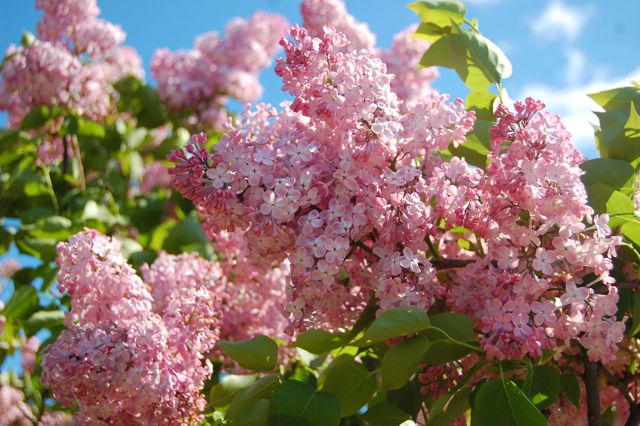
Three other colors paired with pink create quite the wow factor and a stunning bush of pink lilacs ties the whole look together.
Charcoal Blue, a Sherwin Williams color, offers the most drama. Not for everyone, but a dark navy house can be very striking, and the softness of the pink door creates a balanced look paired with silver-toned metal door accessories.
Farrow & Ball’s Slipper Satin is a gorgeous color to paint both siding and trim. Paired with a pink door and a dark brown porch deck and oil-rubbed bronze accessories, you’ve got your drama.
Finally, we have a dark charcoal, Glidden’s Flagstone Grey, that also coordinates well with stonework and contrasts beautifully with pink.

![farrow-ball-sample-pot-slipper-satin-2004-22227-p[ekm]480x480[ekm]](https://i0.wp.com/yourcolorcoach.blog/wp-content/uploads/2018/02/farrow-ball-sample-pot-slipper-satin-2004-22227-pekm480x480ekm.png?w=156&h=156&crop=1&ssl=1 "farrow-ball-sample-pot-slipper-satin-2004-22227-p[ekm]480x480[ekm]")

As you contemplate freshening up your home’s exterior this Spring, see if a glossy pink door with fresh hardware might be the answer to enhanced curb appeal. If you change out the door hardware, don’t forget to match the porch light– an inexpensive upgrade that can make a huge difference. Add a fresh door mat and pot of pink annuals on the porch step and brace yourself for compliments.
Happy Thinking-About-Spring Day, Everybody.
Escape from the Blues
January 4, 2018 § Leave a comment

Horseshoe Bay, Bermuda
This is a perfect January day in New England. We are completely snowed in, and nothing is more relaxing than hunkering down in a cozy house as the wind howls outside and the snow banks pile up around us. I love winter!
But that doesn’t mean I like the wintery gray, the limited daylight, and the bitter cold that comes with it. The longer winter goes, the more I yearn for an escape to somewhere warm — even if it’s only in my imagination.
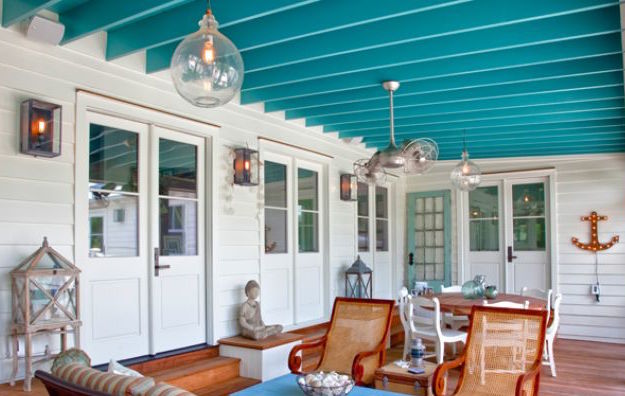
Enter the Sherwin Williams Color of the Year for 2018.

It is an opulent teal that conjures up the ocean and all the warmth of summer at the beach. If a midwinter break in Bermuda is not on your calendar, there are other ways to escape the winter cold — visually. Here are some:
Plan Your Spring Projects. It’s never too early to think about Spring projects, and painting your front door is a doable one. Remember to tie the color in with other accessories and furniture around the yard.
Paint the Fifth Wall. Don’t overlook the ceiling when you’re adding color. Since cool colors recede visually, painting the ceiling a medium teal blue will raise it — like rolling a Utah sky onto your porch.
Splash Color Under Foot. Now I’m making it too easy. Add a gorgeous rug and transform your space instantly. There’s something about the combination of blues and greens that soothes and comforts us all. And a rug adds not just color but texture.

Dive into the Pool. Ceramics, art, dishes, pillows, collectibles, throws, lamps… the options for accessories are endless. Be sure when you add a color to your room that you put it in at least three locations to move the eye around the room and create flow.

Enjoy your staycation! With some daydreaming, a little shopping, and a tad bit of rearranging there at home, you can lift your spirits toward Spring and feel warm and cozy at the same time.
Thanks for stopping by!
Orange Twist to the Red Revival
September 18, 2017 § 2 Comments

Apples, pumpkins, falling leaves — there’s something about Autumn in New England that, despite our recent warm temperatures, makes us cozy up to the changing seasons. Maybe that’s why some of us live here.
My newest door color obsession is a revival of the orangey red of another decade, and that may signal the end of the light, neutral, blue and even light lemon yellow door color trend I’ve focused on for the past several years. This red, Million Dollar Red (Benjamin Moore 2003-10) is as perfect on a traditional white colonial as it is on a black modern home. There is no mistaking where the door is — it screams Welcome!
What I love most about it is its “orangeyness.” Orange is a happy color no matter what. So a red on the orange side (versus pink) says this is a happy home. The color also has an updated, contemporary feel as opposed to the more traditional burgundy red (also great, of course, but more serious and refined).

Adding an orangey red as an accent color on the interior is also a great way to torque up the energy. Try it on the back of a white bookshelf, or on a pouf ottoman in the family room, or even on a focal wall in the front entry. A little bit of red warms up a room a lot. So before painting an entire room red, make sure you want to amp up the temperature in there. Using red on items that can be removed in the hot summer makes sense to me: pillows, bedding, throws, and art. Then I look forward to my seasonal exchange when I swap out the cool blue accessories for red.
Enjoy Autumn… whatever it means to you and wherever you are. And love how the color orangey red makes you feel. Warm and Happy.
Adding POPS of Color — Orange
October 10, 2016 § Leave a comment
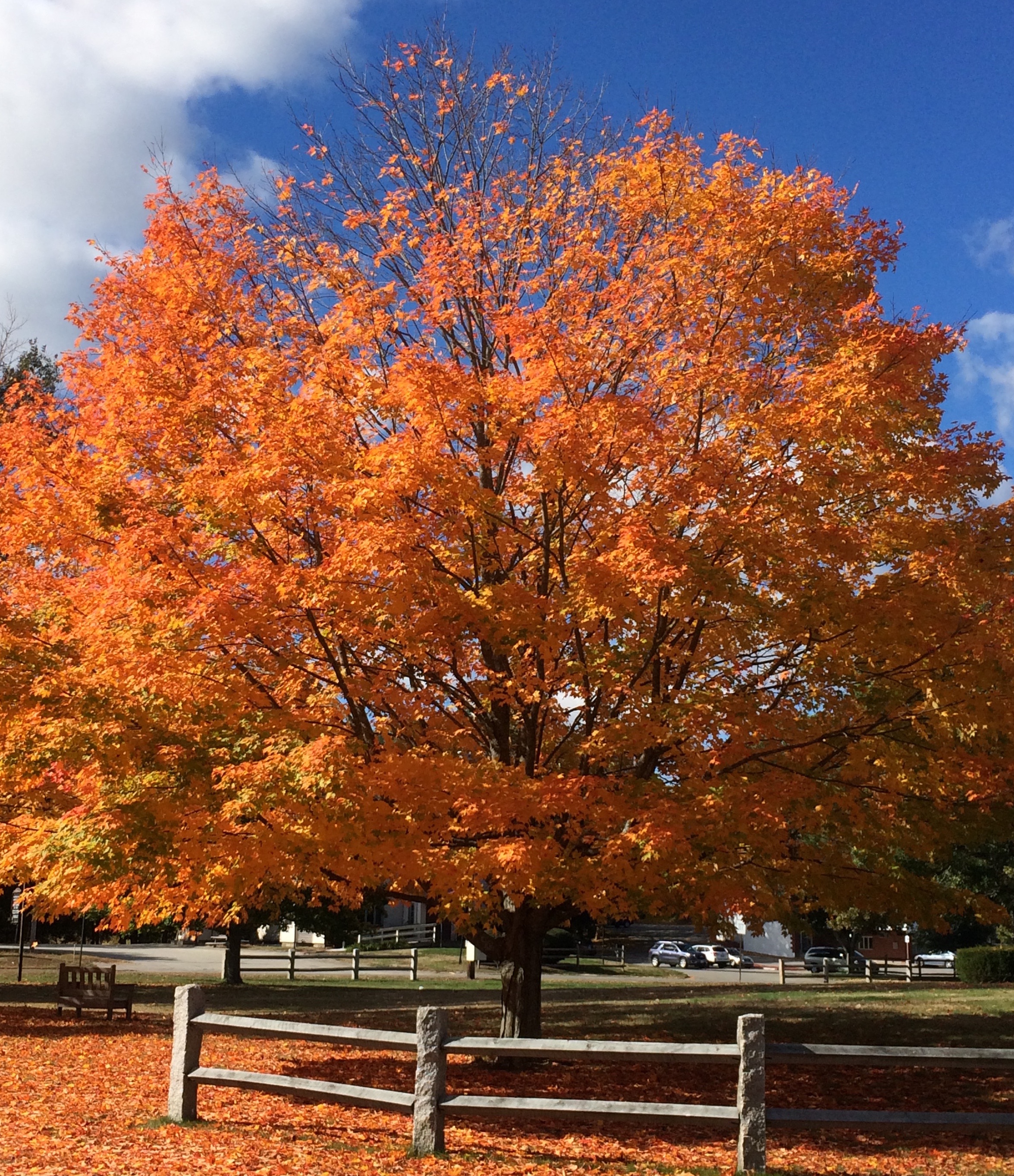 Is there any color happier than orange? Okay, full disclosure. Orange — that special red-orange that you see on maple trees in the Fall in New England — is my favorite color. I don’t wear it, but I love looking at it.
Fall is a wonderful time to add a touch of orange to your home. Go all in with a peppery accent wall in a guest bedroom. Or go easy with a few orange candles on the mantle. I like to switch out my light blue throw pillows on the sofa for orange this time of year. Keeping my sofa neutral lets me do that, and on that first chilly October day, orange pillows warm the room instantly.
What goes with orange? If you want energy, blue (like SW Indigo). Just look at the sky in the photo and how those two complementary colors work off each other. If you want a bit more calm in the room, use a warm gray as a back drop, like the fence in the photo (and SW Dorian Gray).
 Another way to add orange without switching out your furniture and paint color is to introduce a large framed photo of Fall colors. I like to stick with the season we’re in so the photo would come down in the winter and be replaced by a cozy winter scene. Seasonal changes keep the room looking vibrant and fresh.
If all those ideas and colors are still over the top, there’s always squash soup and pumpkin-spice muffins. Sometimes a little color on the dinner table is all you need to enjoy the autumn season.
Stay cozy, my friends.
Trending Front Door Colors
April 25, 2016 § 1 Comment
 What’s trending now in front door colors? Soft pastels. Although the traditional black and red will never go out of style on colonial homes, the palettes of many contemporary and new construction houses have been softened in recent years.
People are still loving the neutral siding colors: whites, grays, gray-blues, and sages. But instead of the dynamic contrast of a front door that shouts, we now have front doors that sing softly.
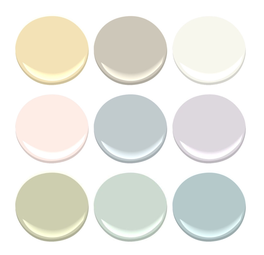
Possibilities:


Benjamin Moore’s offerings:
- Corn Silk, 198
- Revere Pewter, HC-172
- Simply White, OC-117
- Soft Pink, 2012-70
- Gentle Gray, 1626
- Touch of Gray, 2116-60
- Moon Shadow, 1516
- Colony Green, 694
- Yarmouth Blue, HC-150, a personal favorite of mine.
Spring is here! Consider painting your front door with a soft new hue. You’ll love it.
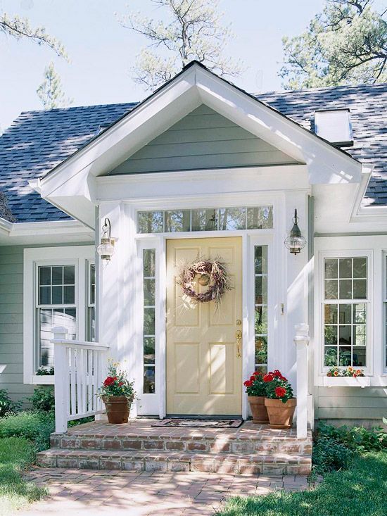
(Photo: Better Homes & Gardens)
Making a House Color Splash
March 15, 2016 § Leave a comment
I have driven past this house for years and every time, I do a double take. Situated next to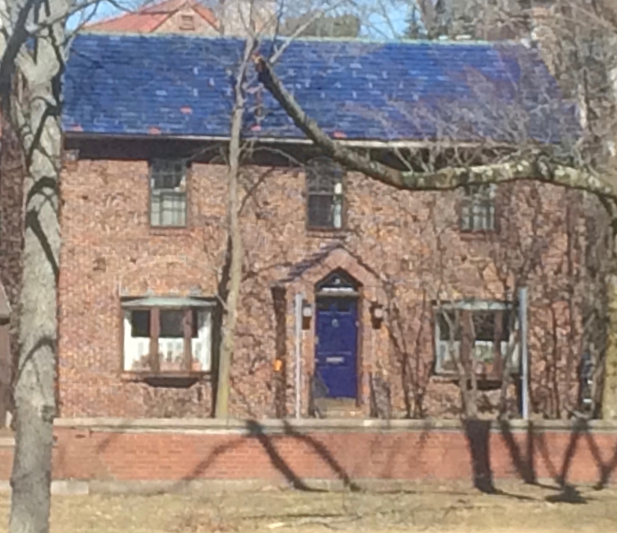 a busy roadway, there is nowhere to stop, get out of the car, and snap a decent photo. But that does not deter me.
The red brick wall is not part of the yard. And who cares about it anyway. It is the roof color and the coordinating front door in a spectacular (guessing here) Starry Night Blue (BM 2067-20) that grabs our attention. The rest of the trim is a quiet brown taken right from the brick. We don’t even notice the window trim at all, and that’s the point.

The roof looks like Vermont Mottled Purple slate, but honestly I have no idea. All I can say is that this house creates, in its traditional neighborhood, a huge House Color Splash. Kudos! And I cannot wait to drive by again.
Don’t forget about the roof color when you are planning your exterior color scheme. It is absolutely fine to keep it neutral, but if you have the personality to withstand the gawking passersby if you decide to add color to the roof, then go for it. Just remember to tie it into the rest of the house with shutters and/or front door to match. I will thank you.
Accent Color Ideas for Stone and Brick Houses
November 17, 2014 § Leave a comment
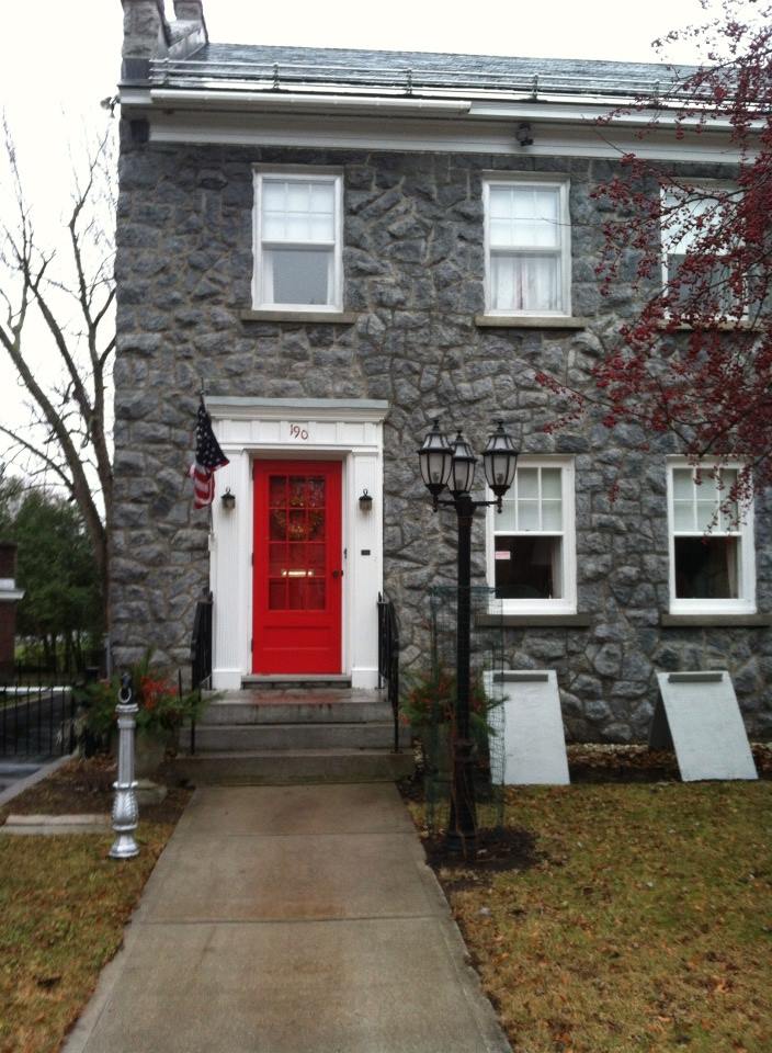
Choosing door or other accent colors for stone and brick homes is easier than you think. If the stone is uniform like this gray, then almost any accent color will work. This homeowner chose tomato red, something like Ben Moore’s Red 2000-10.
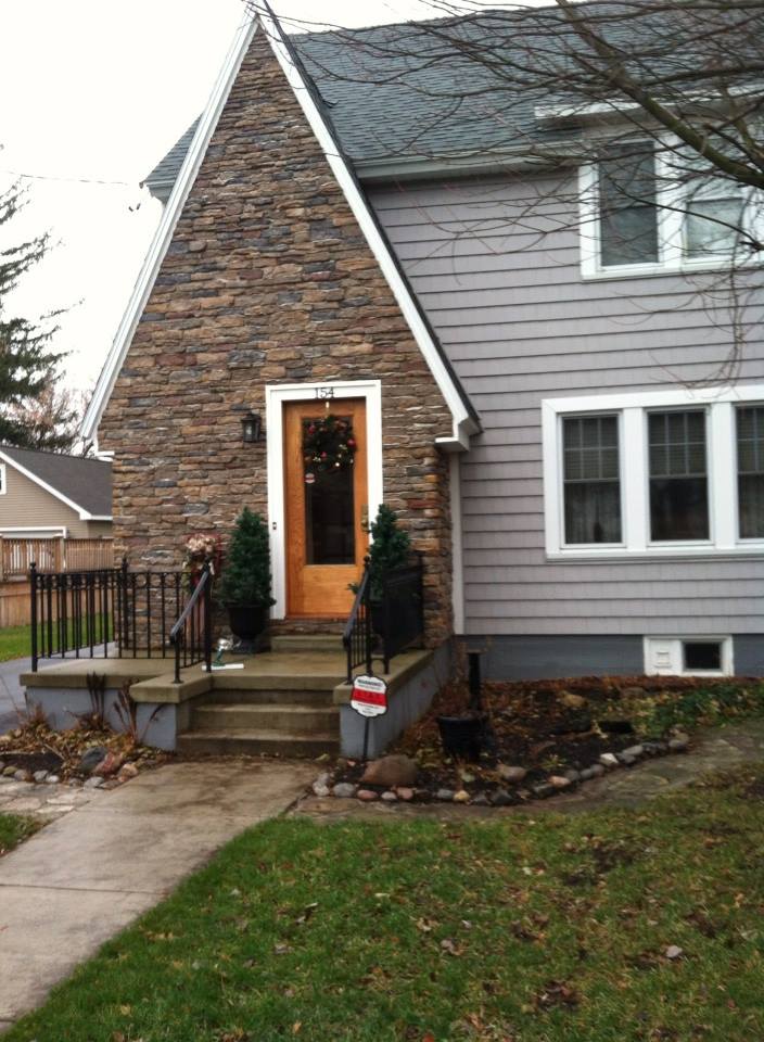
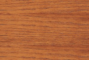
With multi-colored stonework, I like to pick a color out of the palette. In this case, the homeowners chose a gray for the siding and a warm golden color for the natural-wood-stained front door. The orange tone in the wood stain, something like Minwax’s Cherrywood, brings out the depth of color in the stonework and makes the front door warm and welcoming.
For uniformly colored red brick, you can accent with a contrasting color. And the opposite of red, of course, is green. Using a gray-green in a lighter value will prevent the house from looking like Santa’s workshop. Check out Ben Moore’s Louisburg Green HC-113.

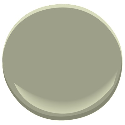
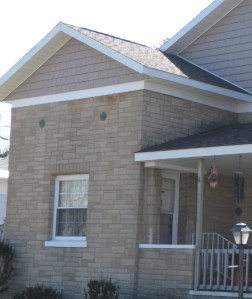
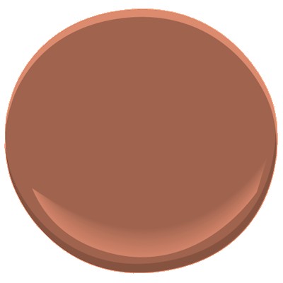
Blonde brick is a challenging palette but consider what hues are in the brick and tease them out. Taupe is a safe bet for the siding and a warm accent like Mayflower Red (Ben Moore HC-49) will warm up the front door.
Let the stone and brick of your house speak to you. Sticking to the color palette that’s already there will make your house coordinated and happy.
