Grabbing Attention at the Front Door: How to Pick a Door Color
July 25, 2011 § 12 Comments
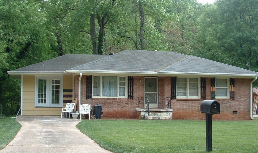
 Red, yellow, and blue are primary colors that attract attention. Used alone or in combination, they will definitely grab your eye. So it’s no great surprise that this house with its pale yellow siding, royal blue door, and red foundation plantings made me slam on the brakes for a quick photo.
The first color you notice is the royal blue. That shade is what many would consider to be the definition of “blue” and with the white trim around the door, it pops. And that is precisely what a front door should do. There should be no mistaking the front door for the service entrance (I just love saying that… you know what I mean … usually the door into the garage).
The front door does not have to be a primary color, for sure, but it should stand out significantly enough from the rest of the house to be a welcoming entrance, and there should be a clearly defined path leading up to it. Front doors that, despite their color, are obscured from view behind a large bush just do not function well. I’ve been to some houses that were so confusing that I ended up walking around the house into the back yard looking for the way in… (this happens primarily when there is no sidewalk or stone pathway to follow — the subject of another post).
If you have two doors on the front of your house, be sure to let people know which door is preferable. Plantings, lights, and a visible doorbell or knocker will guide your guests to the preferred entrance and prevent your greeting partygoers in the mudroom. I suggest painting your main entry door the accent color and the other “service” doors the siding color. Then your guests will not be forced to choose between red doors, numbers 1, 2, or 3.
These are little points in the grand scheme of curb appeal, but I just thought I’d mention them anyway.
Curb Appeal: Go Big or Go Home
July 22, 2011 § Leave a comment

 When it comes to landscape plantings, you don’t need contrasting color to make an impact. Look at this green house — not a single pink annual in sight.
What makes an impact is the scale of the plantings like the big hosta and the white hydrangeas all in various shades of greens and creams — in front of a green house! Who would ever think!
If you want a big bang for the buck (as they say), use large blooms (hydrangeas, peonies) and big leaves (hosta in various shades) to enhance your home’s summer curb appeal with minimal fuss.
Choosing Siding Color (or Colors) for your House
July 19, 2011 § 4 Comments
 If your house has an architectural feature — maybe a porch, a large portico, or a distinctive garage — consider using an accent color for the siding instead of the color you’ve chosen for the house.* The effect is obvious. The accent color will stand out. This color technique is perfect for large houses that might look too massive if they were all the same color. Dividing up the exterior color gives you an opportunity to highlight the design of your home and make a large-scale house a bit cozier.
Speaking of a massive house that could use a little visual down-sizing, maybe we should consider accenting the architectural detail on the White House with a little color! … (oh, forget it… we’d get into that red state/blue state thing — no wonder the place is still white!)
Anyway, color can be used creatively to re-scale a large structure and add visual interest.
If you want your house to look bigger, however, this technique is NOT for you. Dividing up the exterior color chops up the house and calls attention to small areas. If your small house currently has a multi-colored siding palette, consider painting it all one color and using the accent colors for doors, shutters, furniture, flowers, and other accessories.
*The construction of the Doyle Center in Leominster, MA, is really interesting. Here’s a link: http://www.thetrustees.org/what-we-care-about/climate-change/green-buildings/doyle-conservation-center.html
Choosing Colors that “Pop”
June 6, 2011 § Leave a comment
 It may seem obvious, but opposites attract. And when it comes to color, opposites attract attention! These bright orange pansies are the perfect complement to the rich azure blue ceramic basket on the front step of this home. Orange and blue are opposites on the color wheel and, because of that, they give each other a vibrant visual energy that draws your eye. Cheerful, welcoming, fun — everything you want your house to say.
The other opposites? Red with green and purple with yellow.
If you’re planning your garden, planting some annuals in pots, or painting some accent furniture for the yard or the porch, think about what colors will pop off each other. Talk about curb appeal… you’ll certainly attract some attention from the road.
Door and Trim Colors: What to accent
May 18, 2011 § 8 Comments


Choosing an accent color for your house is easier than you might think. If you’re starting with a neutral house and want to add a pop of color, first consider where you want to see that accent color. These Florida homeowners wanted to liven up their drab gray home so they chose a bright blue and highlighted the trim with it (below). They kept the front door white. The result? The house was outlined in blue, which made the house seem smaller, and the builder-white door looked like it had just been installed. (In fairness to the homeowners, this was an experiment! They weren’t crazy about it either!)
What we suggested was that they paint over everything blue with a lighter gray to soften the edges and make the house seem bigger. Then we gave them a few ideas for the front door color, including a buttery yellow — a terrific accent to gray. The warmth of the yellow simply lights up the front entry, and the accompanying yellow pots and greenery finish off the look.
Your front door is the place to start when you’re applying an accent color. The whole idea is to draw your visitors to the entry and welcome them in!
Long-Distance Decorating! From the US to Iraq and Back!
February 15, 2011 § 2 Comments

 It’s not every day I receive a phone call from Iraq to work on a house in Atlanta but last April I did. The guy on the other end of the line had started renovating a house for his mother and was making all the decisions long-distance. Imagine that! Working with a builder on a house renovation is a challenge when you’re on-site — but from thousands of miles away? And for his mother? I was intrigued.
After the builder chose an unapproved yellow for the new addition (see Before Photo on right), my “soldier friend” (as I call him) was not pleased and asked me to come up with a new color scheme for the exterior. And we did not stop there. By way of blog posts, emails, photos, and occasional phone calls, we moved on to porch, shutters, and even the garden shed. Then we moved inside to make paint color decisions, choose light fixtures, and decide how to update the kitchen and bathroom. He sent me photos of options he found online and I gave my advice.
From Iraq to Boston to Iraq and on to Atlanta. The power of the internet is making long-distance decorating possible.
P.S. His mom loves what we’ve done so far! And she loves her son! Success!
Brick Historic House: Trim, Shutters, and Roof Made Easy
November 1, 2010 § Leave a comment
 For those of you with historic brick homes, you cannot beat crisp white trim and charcoal black for your shutter color and roof. Forget about updating your shutters and installing a new multi-colored, dimensional roof. Basic black and white may seem blah, but honestly, good taste and traditional styling are never boring.
Express your own creativity in your landscaping. Keep the plantings symmetrical around the front door to coordinate with the symmetry of your formal house design, but add color and variety of shapes and sizes. Another tip: if you do not want to match all the window treatments on the inside of the house (even though it does look spectacular on a house like this), then at least have matching white lining on the curtains, white sheers, or plantation shutters. Mixing things up with a rainbow of window colors just ruins the formal look.
Living in a historic home is not for everybody. There’s a certain expectation — I’ll talk about informal living in another post… but for now, viva la tradition!
House and Trim Colors that Make a Statement
October 14, 2010 § 3 Comments
 Every now and then I see an accent color that whacks me over the head, and this bold expression of lemon yellow really does it to me this time! Usually a color that does not translate well onto siding or other large surfaces because it’s just too intense, this clear saturated primary color on a shutter paired with black wrought iron hardware on a subdued and sophisticated dark, gray-blue siding is a knock-out! What a statement!
What makes this combination work is the sharp contrast between the gray tone in the siding color and the bright clear shutter. If the siding were another warm clear color, the combination would scream like a caution light. But the calm understated siding lets the yellow attract all the attention. There’s no competition between the colors, just sheer harmony.
Another key to this combination is the “bridge” color that pulls the look together: white. The white trim makes the colors pop — as they say — and it’s critical whenever you use bright colors, either inside or out. White also gives your eye a chance to rest from the intensity of the palette.
But just like other bold statements, be prepared to attract a lot of buzz. And keep the lawn mowed.
How Bold House Colors Can Work
September 30, 2010 § 2 Comments

 What is more refreshing than a creamsicle — that delicious pairing of tangy orange with smooth creamy vanilla! That’s just how I would describe these two houses — absolutely luscious!
Although we don’t often see orange as a house color, the addition of creamy gray-white either as trim color or as part of the architecture makes the combo work. The result is warm and happy without going off the color charts of good taste.
The stucco example here is a house turned patisserie on the grounds of Versailles in France. The other example is a modern home, one of the creative designs by Victoria Mohar of MoharDesign in Somerville, Massachusetts. It is so refreshing to see creative color combinations that work and that push the house color envelope a bit.
If you’re introducing a bold color into your exterior color scheme, pair it with a well-respected neutral, like creamy vanilla. The result will be refreshment for your neighborhood.
Light and Color and Your House Paint
July 31, 2010 § 3 Comments
Sometimes color appears out of nowhere and dazzles you — even for only a few moments — like it did the day I snapped this photo in the late afternoon sun. The yellow of this barn grabbed my attention and said, “Stop where you are and look at me — I am gorgeous!” A few moments later, the barn was in shadow and the intense color was gone for another day.
When you’re choosing a house color, be sure to paint some sample colors on the house and look at them in various lights — early morning, late afternoon — and on cloudy days as well. You may see the color change. That might be a good thing or maybe not. I once watched my living room color change from tan to gray to green to pink all in the course of a 12-hour period. To a color person like myself, that experience was horrendous. I had the primer out within the week. (The color I painted my living room was taupe — the mysterious color that accepts other hues around it and changes like a chameleon. Some people actually like that — I have clients who do — but not so much for me at least on the interior.)
Color depends on light. And light or the lack of it can change your perception of the color itself. What you thought was one color in the paint store or even when you opened up the can turns out to be quite something else once it’s applied to your wall, whether it’s inside or out. Use your sampling time to see how light affects not only the color you’ve chosen but also the “value” of the color (how intense it is). If the color attracts too much attention for your taste, move more toward the gray side of that particular hue. Dull it down a touch and you’ll get it right. Color will be more intense on a large area anyway, like the side of your house. Check it out first before the painters arrive.
