Mirrors Mirrors on the Walls
March 15, 2019 § 2 Comments
I’ve been reflecting a lot lately on mirrors. (Sorry, had to to that.) I love mirrors in decorating. Not only do they bring much needed natural light into a dark room, but they create an illusion of space and even act as art if hung in groupings on a focal wall or along a stairwell.
But sometimes a mirror just doesn’t work. Here are a few tips for placing mirrors that might help you better appreciate them in your home.
- Avoid reflecting light back out the front door.
This is feng shui (it is not good to reflect the chi back out the front door), but it does make decorating sense. Putting a mirror at the front entry so you see yourself entering the home misses the opportunity to see and greet your guests with a beautiful piece of art instead. Just move the mirror to another wall in the entry and you will still add light to the space.
- Make sure the mirror reflects something positive.
Nobody wants to see your kitchen sink full of dishes reflected in the living room mirror. Make sure you place the mirror where it reflects a window or art on another wall in the room.
- Hang mirror over the fireplace instead of tilting it on the mantel.
What happens when you tilt a mirror on the mantel is that it most likely will reflect your ceiling and that’s it. If you hang the mirror, it will reflect the rest of the room and will double the space. Also, just an aside… if you are staging your home to sell, a mirror in the living room is good luck because potential home buyers who see themselves in the home tend to buy it (not a scientific fact, but it has worked so far!).
- Hang bathroom mirror so you can see into it.

It’s okay to let the mirror overhang the bead board (or backsplash tile) as long as you and others can see into the mirror while standing in front of the sink. Although visually, you might be tempted to hang the mirror clearly on the drywall (above the trim work in this photo), in a bathroom, form follows function.
- Make art with groupings of mirrors.
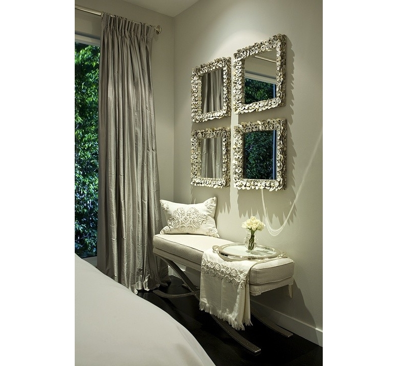
Organizing and hanging your mirrors either by matching shapes or frames (or both as above) or creating a random display of your mirror collection creates a unique focal point on the wall. Especially fun in a bedroom, stairwell or hallway that needs additional light but where the function of each mirror is secondary to its artistic arrangement.
Place your mirrors strategically to maximize their impact on the room. And for hanging really heavy mirrors, make sure you find at least one wall stud to secure the mirror onto the wall.
Mirror mirror on the wall. Be the smartest mirror-hanger of all!
Orange Twist to the Red Revival
September 18, 2017 § 2 Comments

Apples, pumpkins, falling leaves — there’s something about Autumn in New England that, despite our recent warm temperatures, makes us cozy up to the changing seasons. Maybe that’s why some of us live here.
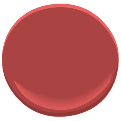
My newest door color obsession is a revival of the orangey red of another decade, and that may signal the end of the light, neutral, blue and even light lemon yellow door color trend I’ve focused on for the past several years. This red, Million Dollar Red (Benjamin Moore 2003-10) is as perfect on a traditional white colonial as it is on a black modern home. There is no mistaking where the door is — it screams Welcome!
What I love most about it is its “orangeyness.” Orange is a happy color no matter what. So a red on the orange side (versus pink) says this is a happy home. The color also has an updated, contemporary feel as opposed to the more traditional burgundy red (also great, of course, but more serious and refined).

Adding an orangey red as an accent color on the interior is also a great way to torque up the energy. Try it on the back of a white bookshelf, or on a pouf ottoman in the family room, or even on a focal wall in the front entry. A little bit of red warms up a room a lot. So before painting an entire room red, make sure you want to amp up the temperature in there. Using red on items that can be removed in the hot summer makes sense to me: pillows, bedding, throws, and art. Then I look forward to my seasonal exchange when I swap out the cool blue accessories for red.
Enjoy Autumn… whatever it means to you and wherever you are. And love how the color orangey red makes you feel. Warm and Happy.
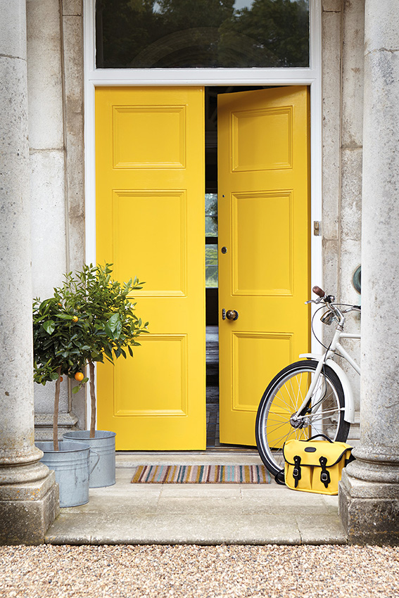
Fab Front Door Color Ideas
November 14, 2014 § 3 Comments
Your front door does not have to be red. Or black. Or green. Or any other traditional color (although there’s nothing wrong with that). Have some fun with your front door color by looking around your yard for inspiration. Or step outside the box by choosing a contrasting color in an unexpected lighter tone. Once you decide on the color, spread it around a bit more by painting a bench or a pot the same color and planting annuals and other flowering shrubbery around the yard to pull the whole look together.
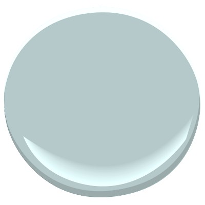
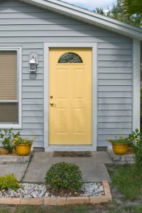
For a BLUE or GRAY house: Consider warm sunny yellow (Ben Moore Concord Ivory HC-12).


For a golden BROWN house, surprise your neighbors with a light shade of contrasting blue (Ben Moore Yarmouth Blue HC-150).
For a white house, consider using a color from your plantings around the yard. Here, the purple lilacs provide the inspiration (Ben Moore Cabernet 2116-30).


For a red house, I still love creamy white trim and a navy door (Ben Moore Hale Navy HC-154).

For a green house, use a natural wood toned door or paint it an earthy rusty brown (Ben Moore Ten Gallon Hat 1210).

And of course a yellow house still looks absolutely smashing with a traditional red door (Ben Moore Moroccan Red 1309).
Your front door should reflect a little bit of you and the home you’ve created on the other side of it.
Is Your Home Ready for its Close-Up Shot?
May 1, 2013 § Leave a comment
 In real estate, a picture is worth a hundred home visits — at least to many potential buyers who cast off rejects as fast as they can hit the Next button.
If you’re preparing your home for the market (or if your home is already on and just sitting), here’s a tip that might get your home ready for its close-up shot and looking good on the big screen (or at least the laptop):
Take photos of your house from the street and then take a shot of every room from the doorway. Then put them on the computer and take a look at what the public is seeing online.
Ask yourselves:
1) Does the photo of the house from the street show that the house is kept up? Is there stuff in the yard? Are there weeds in the garden? Is there peeling paint anywhere? (You can see the to-do list forming, can’t you…)
2) In the photo from the front door, can you see into other parts of the house or is the foyer closed off and dark? Is there old carpeting on the floor or is it tile or hardwood?
3) Inside, are any rooms dark? Do the curtains cover the windows? Is your furniture in sad shape or is there too much of it in a room? (These are the areas to address)
4) And lastly, is there something in the photo that immediately grabs your eye — and not in a good way? It could be a crooked picture or a sloppy bed. That is what the public remembers from that photo.
With to-do list in hand, fix those items that are keeping your house from getting a personal visit from potential buyers. Selling a house is far more than just listing it with an agency and sticking a sign in the front yard. Make sure you value the importance of photos that show your home to its best advantage.
Choosing a Color Palette for Your House: It’s a Natural
January 29, 2013 § Leave a comment
 Another drive-by sighting of some curb appeal. This time, the stone wall pops out partly because of its mix of natural stones (and not just one kind) but also because the house color is drawn from the wall’s palette of natural hues. Even the front steps coordinate nicely with the wall.
Any of the wall’s creams, beiges, browns, and grays would have worked for a paint color, but the builders chose a light creamy yellow for the siding with a beige shingle on the portico. White trim pulls the house together and the black door makes the dramatic statement.
It’s so easy to choose your house color from nature. You cannot make a mistake.
What’s All the Buzz about Undertones?
December 28, 2012 § 5 Comments
Determining a beige color undertone (defined by color expert Maria Killam as “a colour applied under or seen through another colour”) can be tricky. Beige can have one of several undertones: pink, yellow, or green are the basics. If you have dining room furniture with a decidedly yellow/orange hue and walls with a pink undertone like Benjamin Moore’s Georgetown Pink Beige HC-56, then yikes, you have a problem. Off to the paint store.
Bottom Line: Mixing pink-beige with yellow-beige (or yellow/orange) is a big no-no. Fix: Choose a paint with a different (non-pink) undertone like Benjamin Moore’s Monroe Bisque HC-26 that has a yellow undertone and looks great with the golden oak.


If you avoid the mistake of mixing pink and yellow undertones, you’re on your way to understanding them. The other nuances of what undertones to mix and not to mix will come much easier. Note: Mixing pink and yellow vibrant hues is perfectly okay. It’s just the dreaded undertones that can trip you up. Beware.
Does Your House Welcome You Home?
December 18, 2012 § Leave a comment
Other than your golden retriever, what says “Welcome Home” better than an open, organized, well-lit, warmly decorated entryway. Isn’t it nice to swing open the door, hang up your keys, dock your cell phone, stash your purse, and find a free hanger for your coat? … That rarely happens, you say? Still tripping over sneakers and backpacks? Gotcha.
Well, how about a New Year’s Resolution to start with the entryway — whether you come in through the garage or the front door, it doesn’t matter. There are so many organizing ideas available now to help you customize an entry to fit your family and lifestyle. And although some require talent with power tools, there are many other options including stackable cubbies and DIY shelf systems that will tame the clutter.
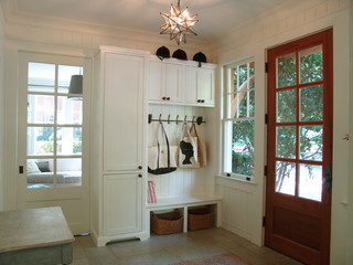
Light woods and white are wonderful in entryways that lack natural light. But if you have large windows, any favorite wall color will look great. Consider choosing an accent color from an adjoining room to give you the “flow” you’re looking for.
Before you tackle any other in-home projects this coming year, make sure your entryway welcomes you home.
