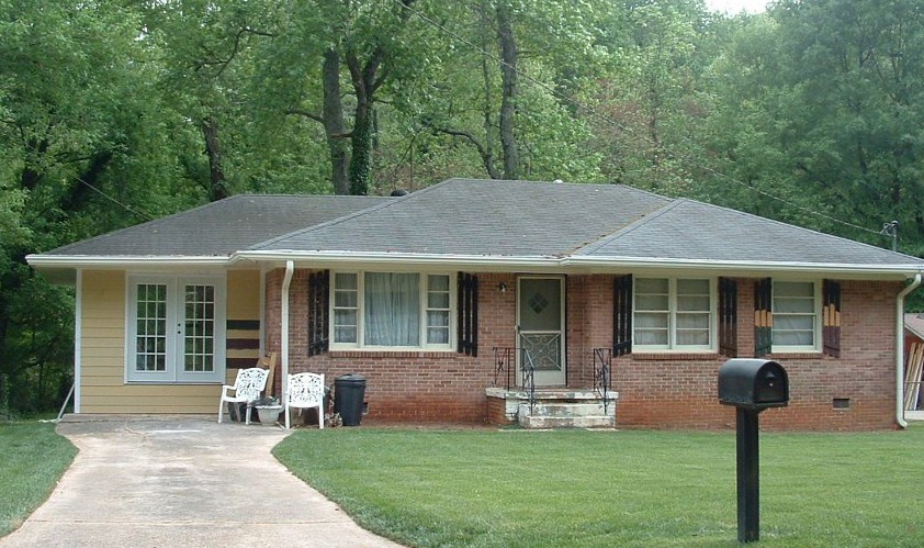
Can I Paint My 1960s Ranch?
June 21, 2011 § 3 Comments
 The answer is yes! With the growing popularity of the spray-painting technique for painting houses (not just lawn furniture anymore), it is becoming easier to paint over rough, textured surfaces like brick and get a good result in a reasonable amount of time.
Check out HGTV.com for some great before-and-after brick house projects. In one show, “Curb Appeal: The Block,” the designer John Gidding takes a paint sprayer to an old ’60s ranch and brings it into the new millenium.
Check with your paint store first, of course. And you might want to hire a professional painter to avoid over-spraying into your neighbor’s driveway (not a good thing…). But if you have a brick house with a) zig-zag-patterned brick; b) really obnoxious brick colors; or c) just tired, run-down plain old red brick, then get inspired! Paint will give your house a fresh new look!
Choosing Colors that “Pop”
June 6, 2011 § Leave a comment
 It may seem obvious, but opposites attract. And when it comes to color, opposites attract attention! These bright orange pansies are the perfect complement to the rich azure blue ceramic basket on the front step of this home. Orange and blue are opposites on the color wheel and, because of that, they give each other a vibrant visual energy that draws your eye. Cheerful, welcoming, fun — everything you want your house to say.
The other opposites? Red with green and purple with yellow.
If you’re planning your garden, planting some annuals in pots, or painting some accent furniture for the yard or the porch, think about what colors will pop off each other. Talk about curb appeal… you’ll certainly attract some attention from the road.
Door and Trim Colors: What to accent
May 18, 2011 § 8 Comments


Choosing an accent color for your house is easier than you might think. If you’re starting with a neutral house and want to add a pop of color, first consider where you want to see that accent color. These Florida homeowners wanted to liven up their drab gray home so they chose a bright blue and highlighted the trim with it (below). They kept the front door white. The result? The house was outlined in blue, which made the house seem smaller, and the builder-white door looked like it had just been installed. (In fairness to the homeowners, this was an experiment! They weren’t crazy about it either!)
What we suggested was that they paint over everything blue with a lighter gray to soften the edges and make the house seem bigger. Then we gave them a few ideas for the front door color, including a buttery yellow — a terrific accent to gray. The warmth of the yellow simply lights up the front entry, and the accompanying yellow pots and greenery finish off the look.
Your front door is the place to start when you’re applying an accent color. The whole idea is to draw your visitors to the entry and welcome them in!
Long-Distance Decorating! From the US to Iraq and Back!
February 15, 2011 § 2 Comments

 It’s not every day I receive a phone call from Iraq to work on a house in Atlanta but last April I did. The guy on the other end of the line had started renovating a house for his mother and was making all the decisions long-distance. Imagine that! Working with a builder on a house renovation is a challenge when you’re on-site — but from thousands of miles away? And for his mother? I was intrigued.
After the builder chose an unapproved yellow for the new addition (see Before Photo on right), my “soldier friend” (as I call him) was not pleased and asked me to come up with a new color scheme for the exterior. And we did not stop there. By way of blog posts, emails, photos, and occasional phone calls, we moved on to porch, shutters, and even the garden shed. Then we moved inside to make paint color decisions, choose light fixtures, and decide how to update the kitchen and bathroom. He sent me photos of options he found online and I gave my advice.
From Iraq to Boston to Iraq and on to Atlanta. The power of the internet is making long-distance decorating possible.
P.S. His mom loves what we’ve done so far! And she loves her son! Success!
Brick Historic House: Trim, Shutters, and Roof Made Easy
November 1, 2010 § Leave a comment
 For those of you with historic brick homes, you cannot beat crisp white trim and charcoal black for your shutter color and roof. Forget about updating your shutters and installing a new multi-colored, dimensional roof. Basic black and white may seem blah, but honestly, good taste and traditional styling are never boring.
Express your own creativity in your landscaping. Keep the plantings symmetrical around the front door to coordinate with the symmetry of your formal house design, but add color and variety of shapes and sizes. Another tip: if you do not want to match all the window treatments on the inside of the house (even though it does look spectacular on a house like this), then at least have matching white lining on the curtains, white sheers, or plantation shutters. Mixing things up with a rainbow of window colors just ruins the formal look.
Living in a historic home is not for everybody. There’s a certain expectation — I’ll talk about informal living in another post… but for now, viva la tradition!
House and Trim Colors that Make a Statement
October 14, 2010 § 3 Comments
 Every now and then I see an accent color that whacks me over the head, and this bold expression of lemon yellow really does it to me this time! Usually a color that does not translate well onto siding or other large surfaces because it’s just too intense, this clear saturated primary color on a shutter paired with black wrought iron hardware on a subdued and sophisticated dark, gray-blue siding is a knock-out! What a statement!
What makes this combination work is the sharp contrast between the gray tone in the siding color and the bright clear shutter. If the siding were another warm clear color, the combination would scream like a caution light. But the calm understated siding lets the yellow attract all the attention. There’s no competition between the colors, just sheer harmony.
Another key to this combination is the “bridge” color that pulls the look together: white. The white trim makes the colors pop — as they say — and it’s critical whenever you use bright colors, either inside or out. White also gives your eye a chance to rest from the intensity of the palette.
But just like other bold statements, be prepared to attract a lot of buzz. And keep the lawn mowed.
How Bold House Colors Can Work
September 30, 2010 § 2 Comments

 What is more refreshing than a creamsicle — that delicious pairing of tangy orange with smooth creamy vanilla! That’s just how I would describe these two houses — absolutely luscious!
Although we don’t often see orange as a house color, the addition of creamy gray-white either as trim color or as part of the architecture makes the combo work. The result is warm and happy without going off the color charts of good taste.
The stucco example here is a house turned patisserie on the grounds of Versailles in France. The other example is a modern home, one of the creative designs by Victoria Mohar of MoharDesign in Somerville, Massachusetts. It is so refreshing to see creative color combinations that work and that push the house color envelope a bit.
If you’re introducing a bold color into your exterior color scheme, pair it with a well-respected neutral, like creamy vanilla. The result will be refreshment for your neighborhood.
Going from Home to Sold: Working with a Stager
August 10, 2010 § Leave a comment
 I know they have to design, stage, and sell in one hour. But on some of those design shows, the home stager comes sweeping through, insulting the homeowners in every room, as if those poor people should know instinctively that the wall color they chose for the kitchen is the only reason their house won’t sell. A good home stager in real life, of course, will tread delicately through the minefield of personal decorating taste and homeowner attachments and end at a win-win.
If you need to sell your home and your realtor recommends a staging consultation, here’s what to expect.
The stager will arrive and begin looking at your home from the curb. Don’t be alarmed or feel invaded. They are there to help you sell. Try to envision this fairly unwelcomed guest as someone who is on your team.
If you haven’t listed your home yet, the stager will walk through your property and evaluate what changes need to be made to sell the home. It’s nothing personal. The stager is seeing your home from the perspective of the buyers in our current market.
The stager will know how to identify all the selling features that your property has to offer and how best to highlight them to buyers.
The stager may give you tips to enhance your landscape or point out areas that need touch-ups.
The biggest nerve that the stager will hit (delicately we hope) is what is personal to the homeowners and needs to be removed from the home if it is to sell quickly and for top dollar: family photos, children’s art and toys, figurine collections, delicate houseplants, years worth of memorabilia, most of the books, and yes, the homeowners’ personal design style. I quipped with one homeowner the other day that we were turning their well-lived-in home into more of a Ramada Inn (with all due respect to Ramada, of course).
The point is, if you’re selling your home, you will want to appeal to as many buyers in today’s market as possible. That means that lots of things that made your house your home need to be packed up so that the potential buyers can see themselves living there.
At the end of the consultation, the stager will leave you with a rather lengthy to-do list. You can plow through it yourselves or call them back to help you. Your realtor will have access to other service providers as well, like cleaners and organizers. Chances are very good that if you accomplish everything on that list, the home you are trying to sell today will become the house that… SOLD!
Top Three Tips for Selling Your House Fast
August 4, 2010 § 1 Comment
 This house sold with multiple offers at the Open House. (Incredible in this picky buyer’s market.) What made this house stand out and what can we all take home from this experience? Here are three top tips:
1. When in doubt, move it out. Although this property had some big things going for it (location, location, location), the family had lived in the house for twenty-plus years and had accumulated not only their own trappings but also lots of odd furniture and artifacts from deceased relatives. This happens to many of us. What do we do with all that stuff? The answer is clear when you’re trying to sell your house: move it all out.
At the first visit, we tagged items that needed to go — things like extra side chairs and small tables, worn furniture, family photos, large area rugs, antiques and breakables — and we left each room with furniture that would identify the room’s function to buyers. The reasonable and highly motivated homeowners then made many trips to a storage facility to clear the decks and let the house “breathe.”
2. Open the door, fix your floor. Remember that old adage, something like, if you want to know if a fellow is well-dressed, look down? Well just like polished shoes, the first thing buyers notice when they open the front door is the floor, and if yours is covered by old, worn or stained carpeting, uh-oh. In general, carpeting is out. Buyers are looking for hardwood floors and tile, both of which provide easy maintenance and no safe haven for dust allergens. If you have hardwoods covered by large area rugs (like these homeowners did), congratulations! Simply roll up the rugs, buff up the floors and go “Cha-ching!” If you have wall-to-wall carpeting, don’t panic. Have it professionally cleaned, and that will help.
3. Make it sunny, welcome the money. You’ve undoubtedly heard this before, but it’s worth mentioning again. The message here is lighten and brighten. This house had dark rooms with rich wall color and heavy window treatments. We lightened the wall color and opened up the windows by removing the heavy drapes and replacing them with airy sheer panels that framed the windows but did not block the light. The result in this family room? An ahhhh feeling.
If you are overwhelmed by the prospects of preparing your house for the market, talk to your realtor. He or she will find you the help you need to get the job done quickly so you can have that “Ahhhh feeling” too!
Light and Color and Your House Paint
July 31, 2010 § 3 Comments
Sometimes color appears out of nowhere and dazzles you — even for only a few moments — like it did the day I snapped this photo in the late afternoon sun. The yellow of this barn grabbed my attention and said, “Stop where you are and look at me — I am gorgeous!” A few moments later, the barn was in shadow and the intense color was gone for another day.
When you’re choosing a house color, be sure to paint some sample colors on the house and look at them in various lights — early morning, late afternoon — and on cloudy days as well. You may see the color change. That might be a good thing or maybe not. I once watched my living room color change from tan to gray to green to pink all in the course of a 12-hour period. To a color person like myself, that experience was horrendous. I had the primer out within the week. (The color I painted my living room was taupe — the mysterious color that accepts other hues around it and changes like a chameleon. Some people actually like that — I have clients who do — but not so much for me at least on the interior.)
Color depends on light. And light or the lack of it can change your perception of the color itself. What you thought was one color in the paint store or even when you opened up the can turns out to be quite something else once it’s applied to your wall, whether it’s inside or out. Use your sampling time to see how light affects not only the color you’ve chosen but also the “value” of the color (how intense it is). If the color attracts too much attention for your taste, move more toward the gray side of that particular hue. Dull it down a touch and you’ll get it right. Color will be more intense on a large area anyway, like the side of your house. Check it out first before the painters arrive.
