Behold: The Gloom of Gray is Lifting
December 12, 2017 § 3 Comments

Thank goodness we’re finally moving away from gray, gray, and even more gray. (If you just repainted from Linen White to Silver Shadow, don’t panic though — it will be okay!) As we move into a new neutral trend (yes, Black), here’s some good advice. Don’t jump on it.
What sometimes happens with trends is that people go overboard with them. They think, aha Gray Trend, I must do everything gray! I have been in so many houses that are all gray on the interior. But in New England, where it’s gray much of the time anyway, those interiors are looking pretty dreary.
The goal should NOT be to create a room that looks like it was decorated in a particular period. The goal should be to create a room that is, as the color maven Maria Killam is known to say, “Classic and Timeless.” http://www.mariakillam.com/whats-next-grey-trend/
How do you achieve that? By mixing stuff up. Here are three basic rules:
- Keep the walls a light neutral. There are wonderful shades of whites out there, and most of them don’t read like spackling paste so don’t be afraid to go light. You won’t have to repaint every couple of years if that trendy color you love goes stale. Compromise? Paint only one wall, the focal wall, that trendy color.
- Keep the large, expensive furniture pieces, like the sofa, plain (remember plaid? No. Go with no pattern or just a texture so that the sofa stays timeless. Color is okay, but make sure you love it!) If you have a well-made sofa that you do not want to replace, you can opt for a slipcover (custom is best — but regardless, make sure the cushions have individual covers.)
- THEN mix things up. Add color in the rug, pillows, art, accessories, and other decorative and personal stuff of life that will make your room feel like it’s yours and not a designer’s.
And of course, let me mention the elephant in the room: inherited pieces. Don’t be afraid to mix your styles to incorporate family heirlooms. You will either have an objet d’art with a story behind it or a cozy room with treasures that remind you of home. Either way, do not be a slave to a particular decorating style just because an inherited piece “doesn’t go.” Embrace it!
Now let’s amp up the color for 2018, shall we?!

Why “Fixer Upper Style” is a Thing
March 28, 2017 § Leave a comment
 What is it about the latest home decorating craze that has us all rushing out to buy accessories that look like they belong in a barn? Well lots of things, it turns out. But first of all, in case your TV is not permanently fixed on HGTV, here’s what I’m talking about.
“Fixer Upper,” the smash HGTV show featuring the lovely designer Joanna Gaines and her cute, goofy, muscled, builder husband Chip, has transformed the design aesthetic in much of the country from Pottery Barn chic to We-All-Want-to-Move-to-Waco fabulous. What Chip and Joanna do with ugly fixer-uppers is remarkable. Here’s a Before & After example of the French Country episode exterior:


The interior style is relaxed with a simple black, white, gray, and cream color palette, reclaimed wood pieces, including “ship lap” (horizontal wide-plank panelling) on the walls, and lots of textures and accessories that Joanna acquires from the “antiques and junk” shops of rural Texas and her own Silos full of treasures at Magnolia Market. She is a master at accessorizing a room to give what others have described as that Modern Farmhouse aesthetic — lived-in yet chic, folksy yet uncluttered. What she does is truly an art — really!

HGTV, Joanna Gaines
Why is this style so popular now??
- We love Chip and Joanna. They radiate love for each other and their four cute children. It’s fun to watch them at home and, like a soap opera, the show is such a refreshing antidote to the routines of our own daily lives.
- The style reminds us of Grandma. Many of the items Joanna finds and uses in her designs are old antiques and treasures we might remember from visiting our grandparents out on the farm. It’s refreshing to travel back to those simpler days.
- The color palette is relaxing. With the over-stimulation of our lives, it’s calming to see whites and woods and neutrals that don’t generate an emotional response. We need downtime in our lives and this style seems to create it.

HGTV, Joanna Gaines
- The style starts from scratch. The show guts houses and creates new spaces. There’s something cathartic about the idea of tearing down walls, donating all the old furniture, and starting with a clean slate. It says something about our group needs as a culture.
- What’s old is new again. Even though the bones of the rooms are new and updated, the look appears old and recycled. Scratches and dents don’t matter in this style. They add character. And how relaxing is it to think that your kids can sit at a table without coasters under the glasses.
- Things have a reason for being there. Joanna’s design uses lots of accessories but the rooms don’t appear cluttered. That is the work of a skilled artist. It’s hard to accessorize mindfully without overdoing.
Tips: If you want to incorporate the Fixer Upper style into your decor,
- Start with the kitchen as it can accommodate extra accessories without appearing overdone.
- Stay authentic. The reason Joanna’s style works is she uses actual old pieces she finds.
- Shop antique and consignment stores to find accessories that fit the style, and don’t forget to look in Grandpa’s old barn. Lots of stuff in there, I bet.
- Do what you love. Make your space a happy one to come home to. That means way more than following a particular trend.
Thanks for stopping by!
Got Personality? Show It
January 19, 2016 § Leave a comment
What does your room say about you? Designer Jeffery Bilhuber (House Beautiful, Feb 2016) infused a boatload of personality and let us know a few other things as well. What this room shouts to me:
- Forget about symmetry. Mismatched end tables are way more interesting than a set.
- Go ahead and mix woods. We acquire furniture from our parents, we find treasures at a flea market, and sometimes pieces have sentimental value. Use them — even if they don’t “match” your decor.
- Add your favorite color to the room. And if you don’t have a favorite, use several. If you keep the colors at the same “hue value” (lightness or darkness of a color), they mix well together.
- Function is important. Don’t forget that you need to set your wine glass down.
- Forget matchy-matchy. This designer has taken that declaration over the top by using two different window shade colors. Bold and impetuous design choice there, but again, the room screams,”I want to be different.” And I applaud that.
- Let color speak in the room by creating a neutral backdrop from which the color can “pop.” Here, the light gray walls and the neutral woven rug give the eye a rest.
- Flowers and the little accessory details finish the room. Without them the room can look cold and staged (too many, of course, and you have a clutter zone).
- Texture matters. That sofa looks so soft. Adding warmth and texture with pillows can warm up anything, even leather.
Bottom line: You’ve heard this before, but it’s worth repeating. Don’t just follow the design trends. Let your room reflect who you are and what you love.
Don’t Let Your Art Fade Away
February 17, 2014 § Leave a comment
 Old faded jeans and old faded glory aside, old faded artwork in your house is a No-Go. If you have art prints that have hung on the wall in your bright cheery living room for several years, take a close look at them. Do they have a blue-green aura to them? Are flowers that used to be red sort of a strange blue? Is there any red or pink left in the piece at all? No?? Then haul it down. It’s done. Off to the recycle bin. Use the frame for something new that will add life to your room. Just this next time, opt for glass that will prevent color-fading. It’s more expensive but worth every penny if you love your art and prints.
Don’t be stubborn. Love your faded jeans, but get rid of your faded art.
Let There Be (New) Light
February 15, 2014 § 3 Comments
 Take a look at your lamps. Have they been on the same side tables for more than 20 years? 30 even? (okay that’s scary) Listen up. One of the easiest and cheapest updates you can do for your house is to exchange the old lighting for something fresh, colorful, and uplifting.
New lamps come in a variety of shapes and sizes, some with colored glass, some with clear. Some have updated metals, some are made to look old. But all have crisp shades with a nice clean barrel shape. (Traditional lamps are still, well, traditional. They will never go out of style. But you know what kind of outdated lamps I mean. Check out your grandmother’s family room, decorated circa 1968. Now you get it.)
You do not have to spend a lot of money. You can shop at a fancy lighting store or Target and get an updated look.
And while you’re looking at lighting, check out your ceiling fixtures. For a few bills at a home improvement store, you can switch out the old brass candelabra flush-mount fixture for something MUCH more current. The change will transform the house — you will see it in a whole new … (wait for it) … LIGHT.
(Lamp from Bellacor: Number 541835)
Surprising House Color Trend — White
February 12, 2014 § Leave a comment
Classic but always with a modern twist, white is trending now as a house color on new construction. Whether we’re craving our grandparents’ old homestead, or we like a crisp, uncomplicated look, white is in. White siding with white trim. But the surprise element lies in the accessories. Fresh options include silver for the metal color (not the traditional black), white or pastel door colors (nolonger black or red), medium-toned metal roof colors (not just charcoal shingle anymore), mismatched out-buildings (that old classic farm look is coming back in a big way), and even (gasp!) white shutters on a white house.
The beauty of white is that it really is timeless. Not only that, but it shows off your colorful flowers and the greenery of your landscaping, the orange patio umbrella and Adirondack chairs, and the turquoise of your backyard pool (okay maybe I’m going a little overboard).
See if a fresh pop of white brings out the character in your house.
Warm Your Soul with Color
January 29, 2014 § Leave a comment
 Those of us with light airy neutral homes are feeling the chill this winter. Whether it’s the frigid temperatures outside or the cabin fever inside, the light, low-contrasting palette we enjoy so much of the year for its calm and cool comfort just isn’t cutting it.
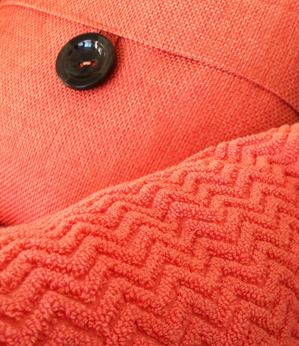
A recent trip to a home goods store had me craving color. On two separate occasions, my eye scoured the store’s palette of spring selections and landed on the same warm vibrant coral. I had to have it. First the pillow. And next time, two towels (for me only, I might add).
Color makes us feel good. Color cheers us up and calms us down. And the right color can make our homes feel cozy and welcoming any time of year. Welcome home, my new coral accents. And if the temps don’t rise soon, I’ll be off to the paint store for a gallon of, you guessed it, coral.
Stay warm, my friends!
Mixed Metals Get My Rave Review
January 24, 2014 § Leave a comment
 Gold and brass are finally officially back. The cheerful, dressed-up metal color has been scorned and ostracized for years, it seems, with homeowners rushing to change out everything from drawer knobs to door hinges. Well, hold up.
Over the past couple of years, we have watched brass trickle back into design (you knew it would) but have been waiting for the main stream to catch on. Now we’re seeing a mix-and-match approach that seems to fit everybody’s home style.
In this kitchen by architect William Hefner (http://www.williamhefner.com/) we see dramatic gold accents along with the other metals (chrome sink and wrought iron light fixtures). What I’m sensing, as with fashion, is that you can pick your accent metal like you pick your hem length. If it works for you, then go for it. We love that approach as it allows you to update your home without having to replace everything in it all at once. Casual acceptance of materials seems way more sensible than dictating that “Metal X” (whatever that turns out to be) is totally OUT.
Hurray for sensible design.
Spring Into Unexpected Color
January 22, 2014 § Leave a comment
Designers are adding pops of color to the previous year’s light neutral color palette and in the most unexpected places. Look up for an opportunity to add color to your white kitchen. Pull some of that ceiling color down into the room with dishes, placemats, and other accessories. And create “flow” between rooms by adding a touch of your ceiling color to the adjoining room.
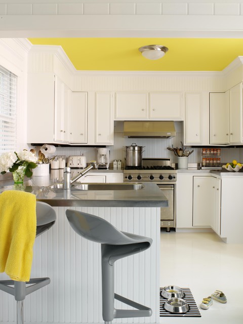
Color trends like this year’s fuschia are fun when you can add the color with inexpensive pillows or a single upholstered chair (http://www.worldmarket.com/product/fuchsia-nina-chair.do). Keeping the base of the room neutral lets you change your color palette when fresh new opportunities arise. Or with the seasons.
