Adding POPS of Color — Orange
October 10, 2016 § Leave a comment
 Is there any color happier than orange? Okay, full disclosure. Orange — that special red-orange that you see on maple trees in the Fall in New England — is my favorite color. I don’t wear it, but I love looking at it.
Fall is a wonderful time to add a touch of orange to your home. Go all in with a peppery accent wall in a guest bedroom. Or go easy with a few orange candles on the mantle. I like to switch out my light blue throw pillows on the sofa for orange this time of year. Keeping my sofa neutral lets me do that, and on that first chilly October day, orange pillows warm the room instantly.

What goes with orange? If you want energy, blue (like SW Indigo). Just look at the sky in the photo and how those two complementary colors work off each other. If you want a bit more calm in the room, use a warm gray as a back drop, like the fence in the photo (and SW Dorian Gray).
 Another way to add orange without switching out your furniture and paint color is to introduce a large framed photo of Fall colors. I like to stick with the season we’re in so the photo would come down in the winter and be replaced by a cozy winter scene. Seasonal changes keep the room looking vibrant and fresh.
If all those ideas and colors are still over the top, there’s always squash soup and pumpkin-spice muffins. Sometimes a little color on the dinner table is all you need to enjoy the autumn season.
Stay cozy, my friends.
SW Color of the Year 2017
September 2, 2016 § 4 Comments
 OKay then! If you hang around long enough…(as they say…)
Taupe is back. The color we’ve spent the last decade ridding our houses of is now Sherwin Williams’ Color of the Year for 2017. Poised Taupe is the color — SW 6039 — and you have to love the description:
“Earthen brown combines with conservative grey and the result is a weathered, woodsy and complex neutral that celebrates the imperfections and authenticity of a well-lived life.” — Anytime somebody celebrates imperfections, I’m in!
But here’s what you should know about taupe. It can change radically with the light and the time of day. What looks a little brown can turn pink, purple, or green depending not only on the time of day but also on the lightbulb. Just so you know. Taupe can have a pink undertone as well that clashes horribly with the orange of a red oak hardwood floor. Another caution. But paired with white like its fan deck sibling Gauzy White SW 6035, a silver metal (not gold or brass), hardwood with a gray undertone, and fabrics in other light neutrals with a pink undertone like Cultured Pearl SW 6028, and you truly have a soft, restful combination that harkens back to those glorious. taupe-filled 50s. That’s 1950s!


Personally, I’m going to ride this one out, but I can appreciate how we’re moving from the grays into the taupes (without the yellow undertone of a previous color swing). Like I tell my clients, just because it’s the Color of the Year does not mean it’s perfect for your house. If you are considering taupe, make sure you have a lot of natural light coming in the window and (hopefully) some modern furnishings, shiny metals and glass. Try to avoid pairing with cherry wood. If you have concerns, talk to me!
Meanwhile, let’s get painting.
Where to Splash Your Kitchen Color
June 9, 2016 § Leave a comment
 White kitchens are, again, all the rage, but what keeps a white kitchen from becoming too cold and uninteresting? You guessed it. Color.
What I love about this white kitchen from Traditional Home is the strategic placement of color where it will 1) have the biggest impact; and 2) be inexpensive to change over time.
Where to put the color?
Backsplash. Since the cabinetry and counter tops are white, the backsplash is a logical place for applying a splash of color. Plus, since it’s a relatively small area in the kitchen, you can be bold with your tile choices knowing that replacing the backsplash when styles change down the road will not break the bank.
Furniture. Splashy citron breakfast bar chairs give the neutral kitchen a modern vitality that pairs very well with the traditional cabinetry. The chairs keep the traditional cabinet design and the timeless marble counter top from being too stuffy. And because there are just two chairs, theoretically you could switch them out seasonally if you wanted to and change the look of the kitchen completely.
Accessories. Always a place to introduce color, the accessories like dishes and canisters and placemats and other easily switched-out items add splashes of color all over the kitchen and are temporary. Again, you’re not locked into a color scheme that will go out of favor in a year or two. Bringing in new accessories in a new color palette will freshen up the kitchen at practically no expense.
No wonder white is such a popular color for the kitchen. It is timeless, and it goes with every decor and season. Plus by adding color in places where new color can be infused without redoing the entire kitchen, you’ve added longevity to your original white kitchen design. Smart thinking!
Here’s the link: http://www.traditionalhome.com/kitchens/design-ideas-white-kitchens?page=0
Making Sense of Color Coding
June 1, 2016 § Leave a comment
 Organizing your clothes and accessories by color makes a lot of sense to me. You pick out your clothes by what colors you want to wear. Am I right? So going straight to the color of the day seems efficient and not only that, beautiful too. Opening the door to see a well-ordered, color-coded closet gives me joy just thinking about it.
On the other hand, I think color-coding can go a teeny bit overboard. And you’re hearing that from a home stager who lives for color and yes, making order out of chaos. But when I see a bookshelf that has been color-coded, it screams STAGED to me instead of a more sensible, and efficient, order of books by either title, subject matter, or author. How would you ever find a book if you have to remember what color it is?
Having said that, I do like to group books by size on the shelves so they’re not all over the place. Bookshelves tend to look so busy in a room that some taming of the clutter helps.
If you’re organizing your bookshelves, consider breaking up the books by inserting objects you’ve collected, stacking some of the books, and even deleting a bunch of books by donating them to a book drop. If you cannot part with your books, put up floor-to-ceiling bookshelves and organize the books so you can find them again. Like a library.
Just my thought for the day. Happy Organizing!
My Favorite Color? Blue&Green
May 13, 2016 § 2 Comments
 When I was in college, back in the style-challenged ’70s, my response to “What’s your favorite color?” was always “blueANDgreen.” They came as a set for me, and even the vintage floral fabrics of that decade
 still have a nostalgic, times-were-great-back-then appeal.
So I am thrilled to see the combination back around, especially for the summer. Talk about bringing the outside in… is there anything more appealing than the yellow-green shades of Hosta together with the cool watery turquoise blues? The combo works for me.
 So as I do every year at this time, I put away all my hot-looking accessories including my red and cream striped window treatments, art with spicey oranges and reds, and all the red pillows on the sofa, and I replace them with the cool-palette colors that remind me of summers at the lake and carefree times. Summer is here!
(Living room photo: Bassett Furniture)
Luscious Paint Colors: Warm Brown
April 5, 2016 § Leave a comment
 What is more welcoming in a home than rich warm color when you open the door. There are no rules that say your walls have to be a shade of white.
If you would like to add rich color like this Warm Apple Crisp (Benjamin Moore 1091) to your home, here are some guidelines:
- Make sure you have adequate light to show off the true hue. Natural light is best with big open windows that allow the depth of the color to show without making the room into a cave.
- Contrast the walls with white — trim work, furniture, accessories — so that the wall color “pops.”
- Pick an accent color from the opposite side of the color wheel to add interest. Since brown is a darker version of orange, blue is its opposite on the color wheel. There is something so fresh about that combination. Insert your accent color with art and accessories like the big, light blue egg on the shelf.
- When choosing colors for one room, consider adjoining rooms. Colors should flow from room to room so this warm brown wall color in the entryway was plucked from the adjoining kitchen cabinetry
 thereby connecting the two rooms and making the house feel bigger and more pulled together.
 - Add cute dog for cozy family feel.
Brown is a wonderful color for making a large space feel more intimate or a small space feel warmer, and it is a great way to bring out the depth of color in the woods in your room. Try it!
Green Decorating: The Soothing Hue
March 17, 2016 § Leave a comment
St. Patrick’s Day brings us to thoughts of green. Whether it’s kelly green or any of the variations thereof, green is a versatile, natural hue that brings life and comfort to any room. It is particularly nice in rooms where you spend time revitalizing your mind and body.


Waking up in a green room warms a cold, white, snowy day and cools a hot, humid summer morning. It can bring the color of lush plants and trees to a city skyline view. And it can calm an agitated, overextended lifestyle at the end of another hectic day.


Green can be either warm (yellow-green) or cool (blue-green), and both pair beautifully with white. Coordinating accent colors can add energy (the complementary reds and pinks, opposites to green on the color wheel) or quiet blending (the analogous yellows and blues on either side of green on the color wheel).
I highly recommend adding green, even a mixture of greens, to your home to quiet and soothe your soul. Wherever you need a few moments of ahhhhhhh.
Paint colors above: Top left to right: Waterscape SW 6470, Topiary Tint SW 6449, Honeydew SW 6428, Breaktime SW 6463. Bottom left to right: BM Guilford Green HC-116, Palisades Park BM 439, High Park BM 467, Dartsmouth Green BM 691.
Making a House Color Splash
March 15, 2016 § Leave a comment
I have driven past this house for years and every time, I do a double take. Situated next to a busy roadway, there is nowhere to stop, get out of the car, and snap a decent photo. But that does not deter me.
The red brick wall is not part of the yard. And who cares about it anyway. It is the roof color and the coordinating front door in a spectacular (guessing here) Starry Night Blue (BM 2067-20) that grabs our attention. The rest of the trim is a quiet brown taken right from the brick. We don’t even notice the window trim at all, and that’s the point.

The roof looks like Vermont Mottled Purple slate, but honestly I have no idea. All I can say is that this house creates, in its traditional neighborhood, a huge House Color Splash. Kudos! And I cannot wait to drive by again.
Don’t forget about the roof color when you are planning your exterior color scheme. It is absolutely fine to keep it neutral, but if you have the personality to withstand the gawking passersby if you decide to add color to the roof, then go for it. Just remember to tie it into the rest of the house with shutters and/or front door to match. I will thank you.
Great Color Combos: Pink & Orange
February 18, 2016 § Leave a comment
 One glance at Taylor Swift’s Grammy red carpet ensemble and I was inspired. What a great color combo! Reminiscent of gorgeous summer sunsets and gardens of spring tulips, hot pink and vibrant coral scream happiness and passion. No shyness there. That’s for sure.
You can bring those colors into your home. Here’s how:
–Add plenty of white. Nothing brings out the true color of anything better than white. That’s why adding white flowers to a garden landscape makes the color in the garden “pop” (as we say).
–Mix colors of the same Hue (color) Value (relative lightness or darkness). They will blend better together without one overtaking the other.
 –Add plenty of neutral texture. Sisal rugs, nubby neutral chenille pillows, and natural (neutral) linen-like window panels will balance the powerful color statement in the room and cool the temperature down a bit.
–Go part-way in. To make a major color statement without a huge commitment, stay completely neutral in the paint, furniture, rugs, and windows and add color with your accessories: art, pillows, lamp bases, and other accessories.
Look for other great color combos in fashion and nature. Find what you love!
Photo: Jordan Strauss/Invision/AP./ Published: 02/16/2016 9:24:16. Pillow: Pottery Barn.
From Color Inspirations to Paint
February 4, 2016 § Leave a comment
Walking into a pottery shop is like immersing yourself in a box of crayons, all pristine and unbroken with endless possibilities of combinations.
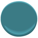
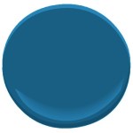
 This set of dazzling bowls caught my eye. Mesmerizing is how I’d describe them with an array of blues from turquoise to cornflower. (The dishes are mine now.)
Whatever the inspiration, there is a paint project waiting. In my mind’s eye driving home, I see these dishes in a dining room painted any one of the colors with crisp white trim. Maybe even a shiny white bead board around the wainscoting to bring out the hues in the room. I can also see any one of these colors on the walls in a kitchen with white cabinets and a white subway tile backsplash. Or maybe one of these colors for the backsplash! (Head is spinning with ideas.)
Accent walls give us a way to add a small amount of color drama to the focal area of a room without painting everything. Especially nice in open-floor-plan spaces where walls may incorporate several rooms. How about one of these rich hues for your front door? Spring painting is right around the corner. (Ben Moore’s Calypso Blue, Bermuda Blue, and Deep Mulberry)
Let the color in front of you and surrounding you inspire you. Wrap yourself up in it. Do something for yourself and create a happy house. It’s just paint!
