Ready to Immerse Your Home in Color?
November 25, 2014 § Leave a comment
 As with haute couture in the fashion world, we often look to hotels and other public spaces for trends in home color and design. Look no further than The William, a boutique hotel in New York, where each room immerses its guests in a paint bucket of saturated color punctuated by droplets of white for chroma relief. I am not sure if you can order up a particular color to match your luggage, but nevertheless, your experience there will be unforgettable.
Are we ready to move this color trend into the home? Some already have, but many of us will take a little while to move back into the rich dark hues of a decade ago. I’m just getting used to the freshness and brightness of white walls. But who knows.
 If you are contemplating a project that involves intense color, start with a small space like a guest bath or a guest room where the color will make a huge impact and the cost of painting over it will be minimal. Make sure you have adequate lighting so the color will show “true” and you will not end up in a cave. And remember to punctuate your color with white or cream to make the color “pop” and add bits of black not only to avoid the I-got-lost-in-a-box-of-crayons look but also to add an air of sophistication to the project.
Full color on!
(photos from Dwell magazine)
Fab Front Door Color Ideas
November 14, 2014 § 3 Comments
Your front door does not have to be red. Or black. Or green. Or any other traditional color (although there’s nothing wrong with that). Have some fun with your front door color by looking around your yard for inspiration. Or step outside the box by choosing a contrasting color in an unexpected lighter tone. Once you decide on the color, spread it around a bit more by painting a bench or a pot the same color and planting annuals and other flowering shrubbery around the yard to pull the whole look together.
For a BLUE or GRAY house: Consider warm sunny yellow (Ben Moore Concord Ivory HC-12).

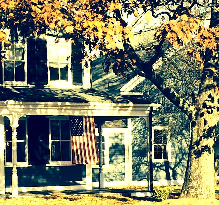
For a golden BROWN house, surprise your neighbors with a light shade of contrasting blue (Ben Moore Yarmouth Blue HC-150).
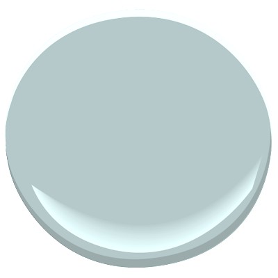
For a white house, consider using a color from your plantings around the yard. Here, the purple lilacs provide the inspiration (Ben Moore Cabernet 2116-30).
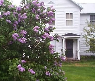

For a red house, I still love creamy white trim and a navy door (Ben Moore Hale Navy HC-154).
For a green house, use a natural wood toned door or paint it an earthy rusty brown (Ben Moore Ten Gallon Hat 1210).

And of course a yellow house still looks absolutely smashing with a traditional red door (Ben Moore Moroccan Red 1309).
Your front door should reflect a little bit of you and the home you’ve created on the other side of it.
Choosing House Colors in a Colorful World
November 10, 2014 § 1 Comment
 “Anyone who claims to be an expert on color is a liar,” assert Joann and Arielle Eckstut in their book The Secret Language of Color. I (hesitantly, of course) agree. Asking someone to pick a color for you is like asking a stranger to describe your personality, your favorite sweater when you were five, and your family tree. But hey, with a series of clues, we color “experts” do it all the time.
The colors you end up with for your home, your clothes, your car and everything else should be a reflection of you. But how we make those choices is dependent upon our associations between colors and objects or feelings (yellow can conjure up sunshine and happiness or anger and agitation), our culture (Americans tend to prefer blue, Asians red) and even our ability to distinguish certain colors at all (some red/green color-blind individuals see only a gray scale).
When choosing a house color, there are even more considerations: neighborhood, age of house, natural environment, and frankly whether or not you want your house to blend in or stand out. For the most part, we tend to use colors in the palette of nature: beiges, taupes, grays, greens, and occasionally reds, yellows and blues. Nature colors can blend a house into the tree-lined landscape in the backyard or the row of stone walls in the cul-de-sac. Red can echo the autumn colors lining the street or the late afternoon sunset. Yellow can fit just as well in a quaint New England town as it does along the coast of Malibu. And blue in all its various shades looks fabulous on a house between the dunes at the beach.
But what if you want your house to stand out in a world full of color? Don’t overlook white. It can be warmed up or cooled down with the seasons and it will never go out of style. Splashing in a no-color “color” like white into a palette (whether it’s your neighborhood or the front garden) not only makes the surrounding hues more vivid but also serves as a beacon of relief in a multi-colored landscape. When choosing a floral display that I knew would be surrounded by other beautiful, multi-hued arrangements, I chose white. And sure enough, what showed up the most? White. (What color is the bride? White.) You get the picture…
Be your own color expert. Choose what you like. Fit in. Stand out. Or ask one of us to help.
