Making a House Color Splash
March 15, 2016 § Leave a comment
I have driven past this house for years and every time, I do a double take. Situated next to a busy roadway, there is nowhere to stop, get out of the car, and snap a decent photo. But that does not deter me.
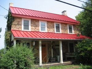
The red brick wall is not part of the yard. And who cares about it anyway. It is the roof color and the coordinating front door in a spectacular (guessing here) Starry Night Blue (BM 2067-20) that grabs our attention. The rest of the trim is a quiet brown taken right from the brick. We don’t even notice the window trim at all, and that’s the point.

The roof looks like Vermont Mottled Purple slate, but honestly I have no idea. All I can say is that this house creates, in its traditional neighborhood, a huge House Color Splash. Kudos! And I cannot wait to drive by again.
Don’t forget about the roof color when you are planning your exterior color scheme. It is absolutely fine to keep it neutral, but if you have the personality to withstand the gawking passersby if you decide to add color to the roof, then go for it. Just remember to tie it into the rest of the house with shutters and/or front door to match. I will thank you.
Two Rules for Choosing a Roof for your House
January 28, 2013 § 2 Comments
 The roof — any roof — is a big-ticket item on the house so choosing it can be a little unsettling. There are so many colorful options available that it’s easy to get wowed by the prospect of something other than the traditional charcoal.
When choosing your roof, make sure you follow these two rules to insure a good result you can live with for, say, 40 years:
1) Get large samples of your roof options. Do not choose a roof from a photo on the computer or a little brochure. Make sure you hold the roof sample up against the side of your house to test for color coordination and to see how busy the two are when side-by-side. Stand back at the curb and take a good look. If possible, get the address of a home that has the roof already installed so you can see how the roof looks over a large area. Does it get lighter or darker? Good to know ahead of time.
2) Avoid the clash of the Maximum Definition shingles with the house. If your house is a busy colorful mixture of bricks or stones, avoid the busy “max def” roof as you will create a combination worthy of a major migraine. The photo above (from Owens Corning) is a good example of pairing a busy max def roof style (with its multiple colors) with a house siding that is neutral, painted brick and neutral siding. There is a good balance between the busy roof and the plain, calm siding materials. There’s no doubt that the roof takes center stage. Make sure it doesn’t fight with the siding “understudy.”
If you follow these two rules, you will narrow your options down to two or three reasonable choices and avoid any major, expensive roof mistakes.
Choosing a Metal Roof Color
January 7, 2013 § 4 Comments
Just a pet peeve of mine, but I really do not care for a bright red metal roof on an old historic stone house. I know that some of my bias is regional–I’m sorry if I’ve offended anybody’s taste. But what I much prefer is a color that comes from the stone itself. What that does is blend the roof with the house and not call it out like a big old stop sign on a dirt road.
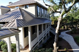
This photo shows a neutral option for a metal roof color. Perfect actually for the little stone house above.
If you are choosing a metal roof color for your home and you do NOT want to feature the roof as the focal point of the neighborhood, choose a color that blends or approximates a traditional roof color (grays, bronze, brown, charcoal, black). On the other hand, if you need people to find your house in a snowstorm, then choose a bright Crayola color and love it. Fair warning.
Which Came First? The house color or the foundation plantings?
October 1, 2012 § 2 Comments
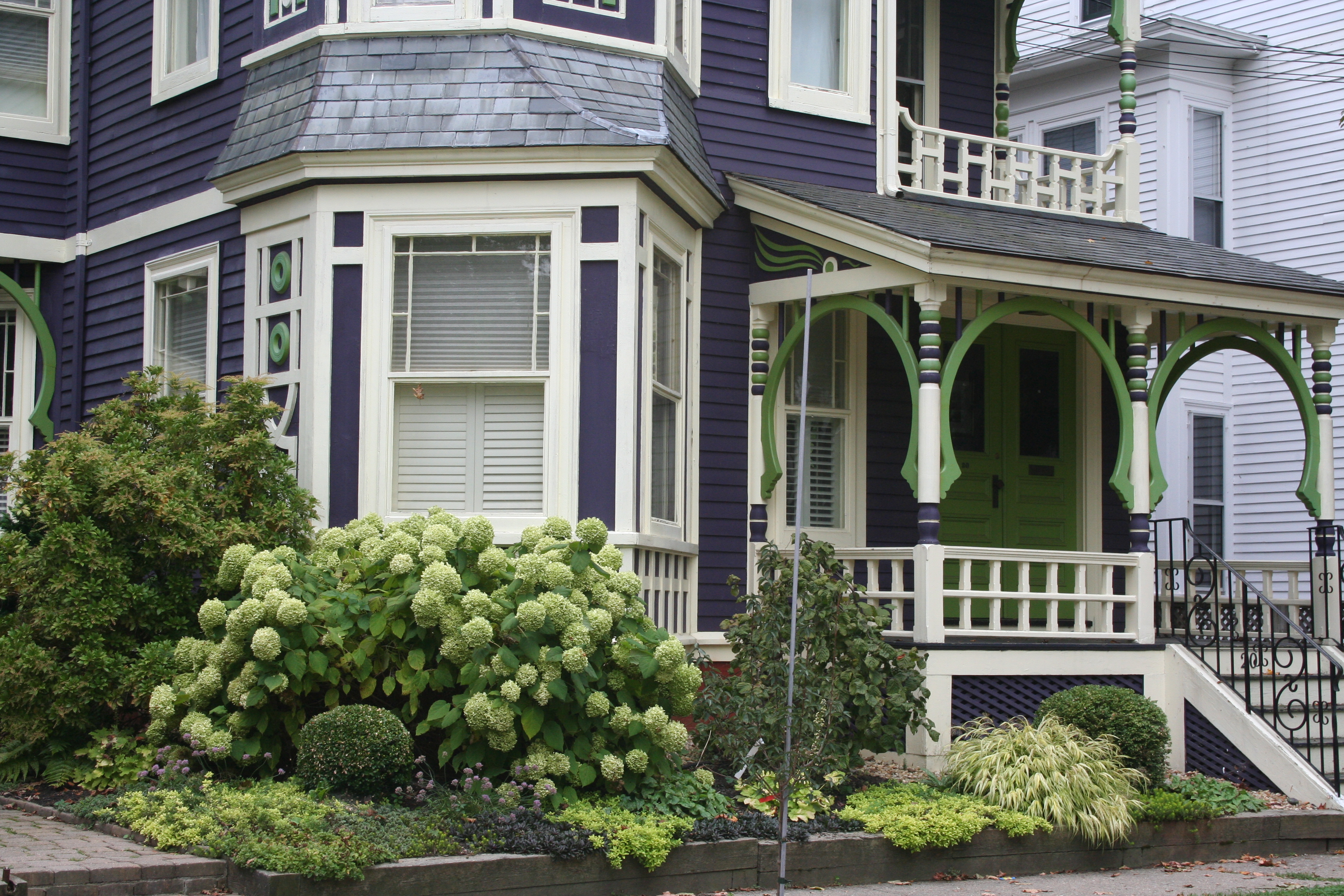 My guess? Neither. Take a close look at the roof, and the house color palette is revealed. The deep purples and greens of that slate roof present a palette the homeowners can use for their house: rich grape for the siding color tempered by a neutral cream trim and lime green for the accent color to highlight the Victorian embellishments.
But the homeowners did not stop there. To enhance the palette and spread the accent color out onto the landscape, they planted a gorgeous lime green Hydrangea coupled with other lime green plants, shrubs, and ground-cover species. Peeking out from under all that greenery is a purple flowering ground color pulling the whole look together.
Not to be matchy-matchy or anything, but this house rocks. There’s just enough contrast to keep our interest and show off the house detail without introducing new colors that might make the house too busy. Afterall, the house itself has so much detail that you wouldn’t want it to get lost in a rainbow of foundation plantings and annuals.
Choosing a New Roof Color
October 4, 2011 § 4 Comments
 Sometimes a house looks a little too hot for the neighborhood. And for this orange brick house in a neighborhood of other orange brick houses, the matching orange roof took the house over the top (literally!).
The cool grays and whites in the trimwork could not balance the warmth of this overall orange color scheme. To give the eye a cool compress, we chose a gray roof that picks up the many gray tones in the brick trim around the windows and doors and contrasts nicely with the orange brick. The roof is Georgetown Gray by Certainteed. Now the palette of warm and cool colors distributed evenly makes the house look balanced and pulled together.
If you are choosing a new roof, remember that the roof color is as much  a part of your home’s color scheme as the siding and trim colors. Even more so because you will not be changing the roof anytime soon. It is okay to choose a roof color from the same hue family as the siding color (a brown roof with a tan house, for example). But remember to create contrast somewhere, either with the trim color or the pop of color on the front door. If you have a brick house, choose a neutral color that is in your brick or choose a dark neutral that will allow your brick to take center stage. When in doubt, seek the help of a professional in your area or write to me. I’ll help you. A second set of eyes is critical before you make that big investment.
Driving up to your house should make you say, “Ahhhh, good to be home.”
Bold, Beautiful and Blue Roof
October 1, 2011 § Leave a comment
 Some houses whisper. Some houses shout. This house sings opera! What makes this house so melodic is perfectly obvious to everybody who drives by. It has the most incredible roof and door color: a rich sapphire blue like you’ve never seen before except maybe in the Mediterranean. We’re certainly not accustomed to seeing that color on a traditional burgundy brick colonial, usually relegated to browns and charcoals (not that there’s anything wrong with browns and charcoals — I love them too).
This house tosses conventional color schemes out the window yet manages to look both whimsical and classy at the same time. It peeks out from behind big shade trees making it even more alluring to passersby. Like a secret garden around the corner, the act of discovery is part of the thrill.
The door color alone would be quite a find, but the fact that the roof is the same rich blue makes this house an opera star I want to discover again and again. Big applause!!
Brick Historic House: Trim, Shutters, and Roof Made Easy
November 1, 2010 § Leave a comment
 For those of you with historic brick homes, you cannot beat crisp white trim and charcoal black for your shutter color and roof. Forget about updating your shutters and installing a new multi-colored, dimensional roof. Basic black and white may seem blah, but honestly, good taste and traditional styling are never boring.
Express your own creativity in your landscaping. Keep the plantings symmetrical around the front door to coordinate with the symmetry of your formal house design, but add color and variety of shapes and sizes. Another tip: if you do not want to match all the window treatments on the inside of the house (even though it does look spectacular on a house like this), then at least have matching white lining on the curtains, white sheers, or plantation shutters. Mixing things up with a rainbow of window colors just ruins the formal look.
Living in a historic home is not for everybody. There’s a certain expectation — I’ll talk about informal living in another post… but for now, viva la tradition!
Brick Tudor Siding, Trim, and Roof Color
July 27, 2010 § 6 Comments
 Brick is one of those design elements that people either love or hate. Well over half of the questions that come to me have to do with brick: How do we work with the brick? How do we pick a siding that goes with the brick? What about roof color and brick? Can I paint my brick? How can I possibly live with this brick?
Here is a photo of an early-last-century, Tudor-style home with the signature brick gabled entry and chimney. The brick is monochromatic (not a lot of contrast between individual bricks), and it is a very pleasant dark muted red color.
The new homeowners chose an olive green siding color which complements the brick and makes it stand out as a feature on the house. (That works great if you like the brick! I’ll address what to do if you hate your brick in another post.) The muted olive siding color balances the muted red of the brick so that the house elements are in harmony (a fancy way of saying “They just work!”). Even though the windows themselves are white, the homeowner chose cream for the trim color. Cream is much softer than white and is preferable to white on older homes or with earthy palettes. And see? You can use cream trim with white windows and not ruin the house.
As for the roof, obviously this is a new roof and the homeowners took advantage of the myriad choices available to them. The muted brown tones pick up on some of the browns in the brick and again pull a very visible element of this house — the roof — successfully into the palette.
Traditional wrought iron sconces and mailbox as well as period hardware on a solid wood door provide the perfect jewelry topped off by a real, not plastic, concrete urn on the front steps for summer flowers.
These homeowners took an old home and modernized it in a tasteful way that pays homage to the home’s original Tudor styling. The result is both fresh and historic. Perfect house synergy.
